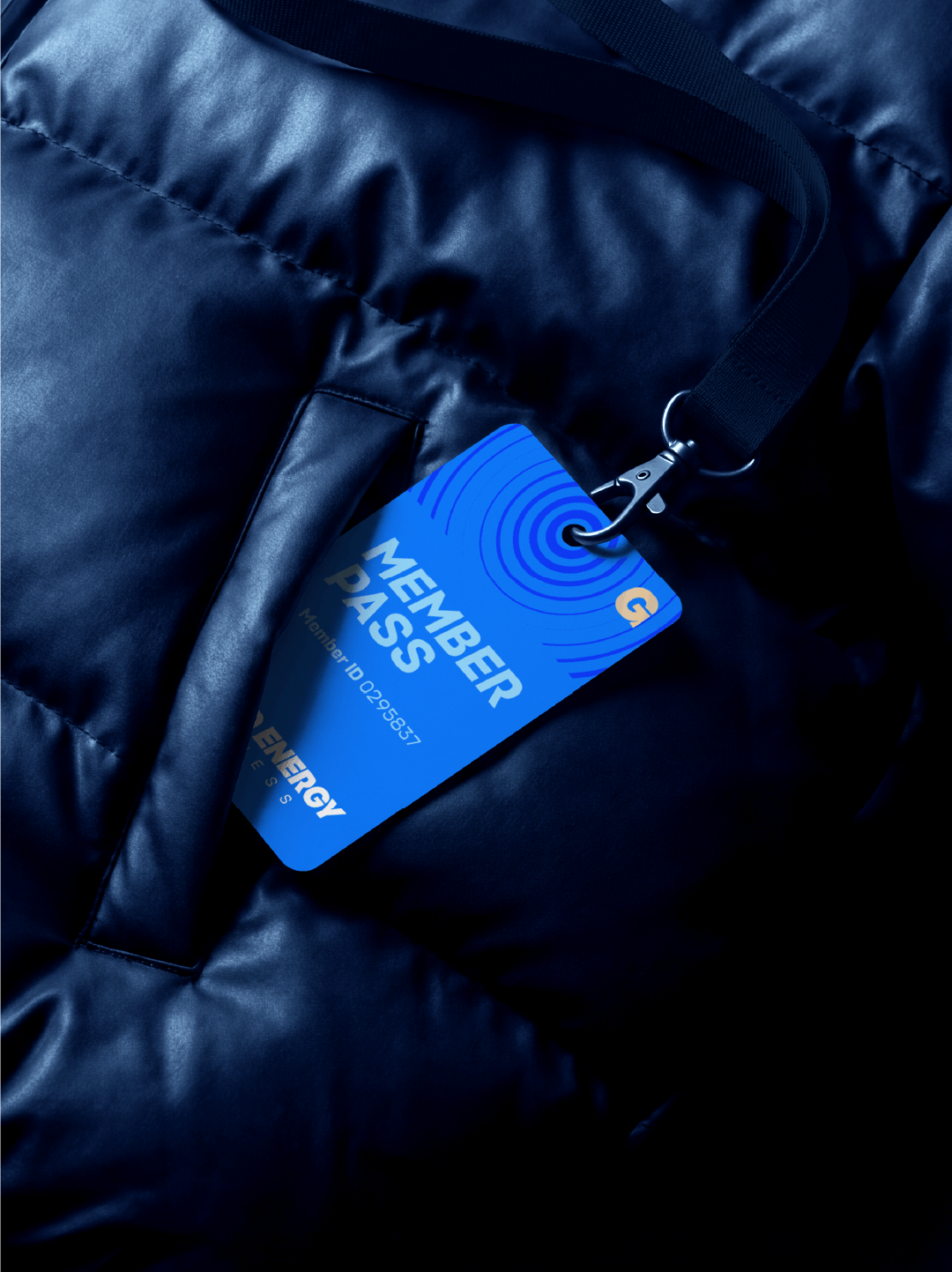
Good Energy Fitness
Problem:
To devise a strong identity for a women’s only gym, that doesn’t feel stereotypical.
Solution:
Focus on being a solid gym, that also offers safe spaces and strong community.
My involvement:
Planning, creative direction and execution were led exclusively by me.
Deliverables:
• Brand Identity
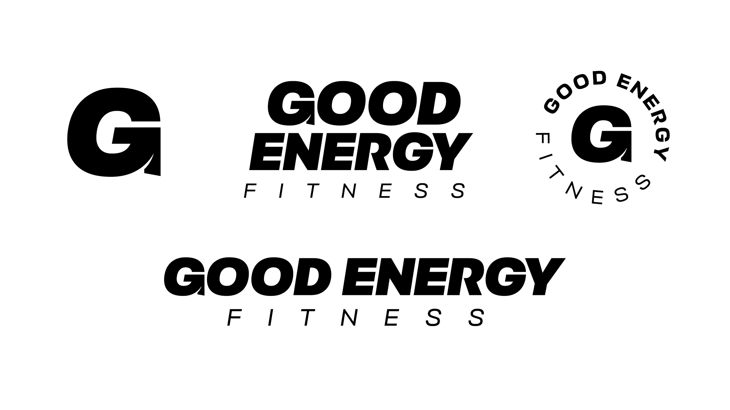
• Primary & Secondary logos
• Gym signage
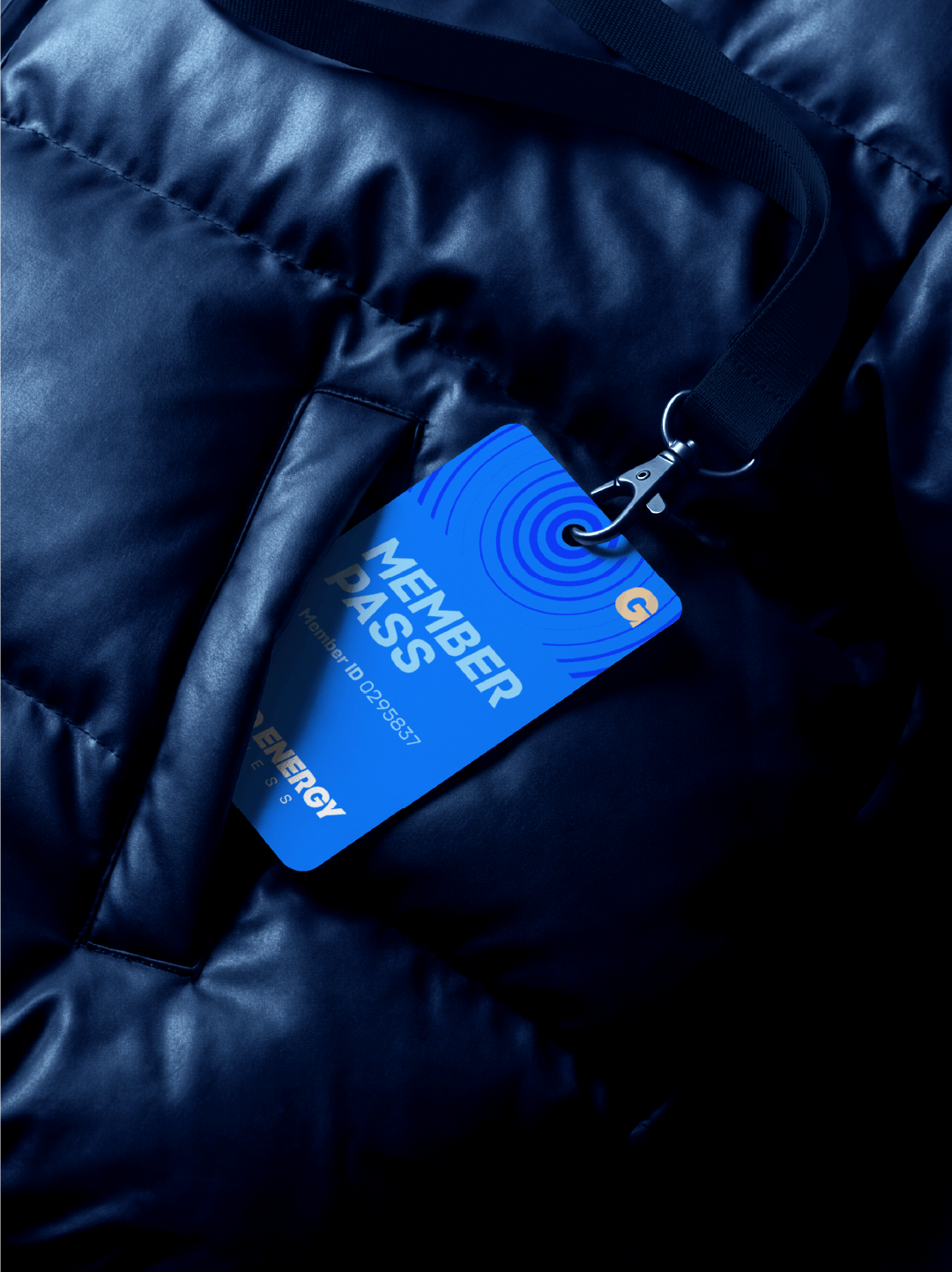
• Membership card
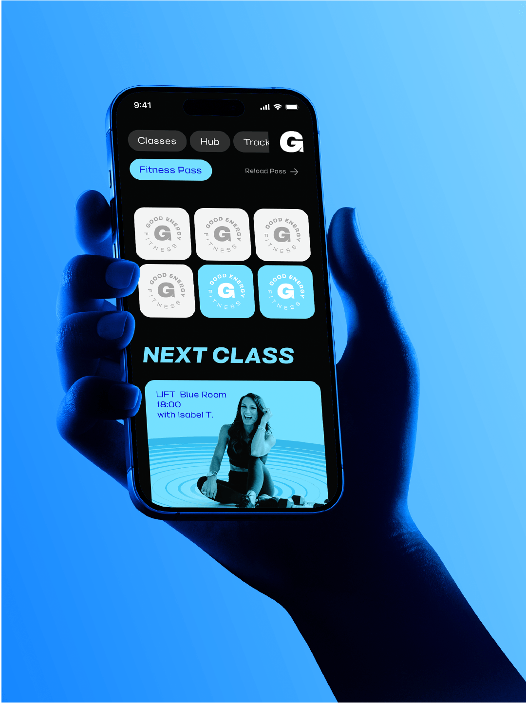
• Fitness pass
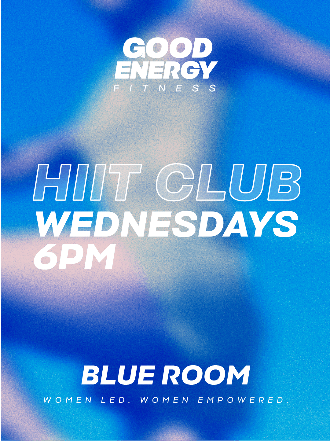
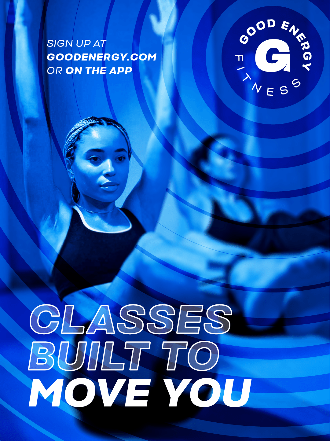
• Social media campaign
Research & Moodboard
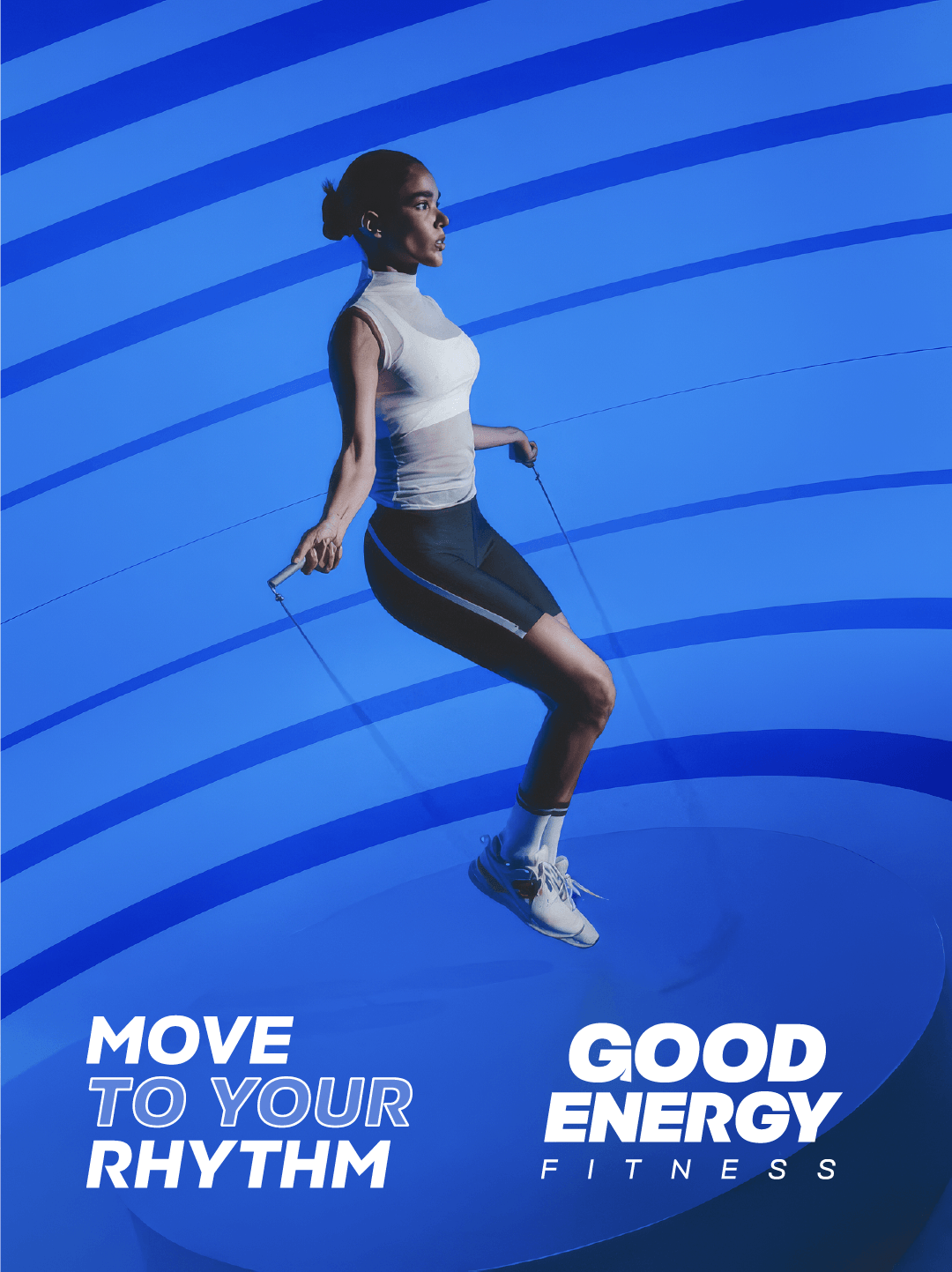
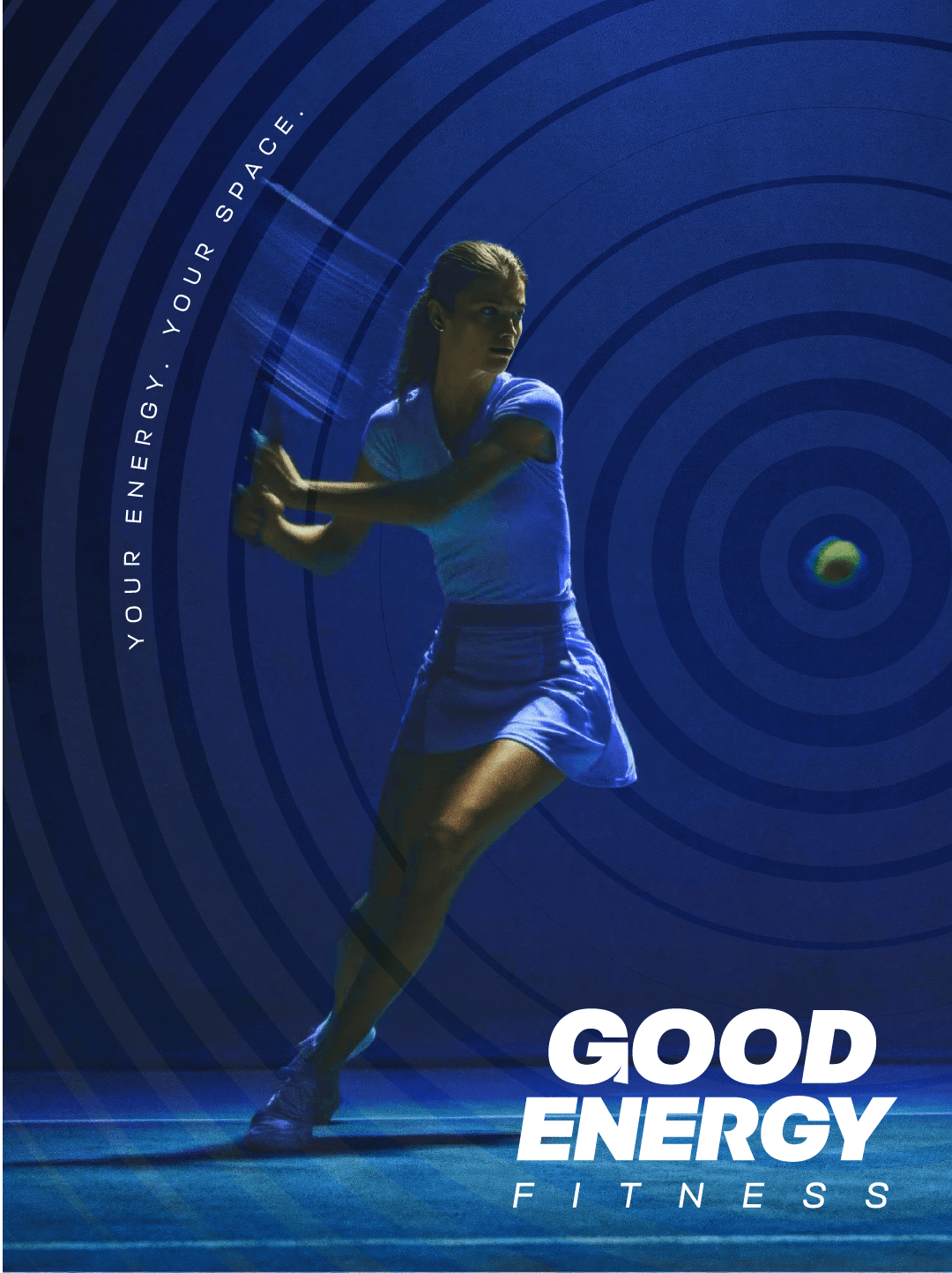
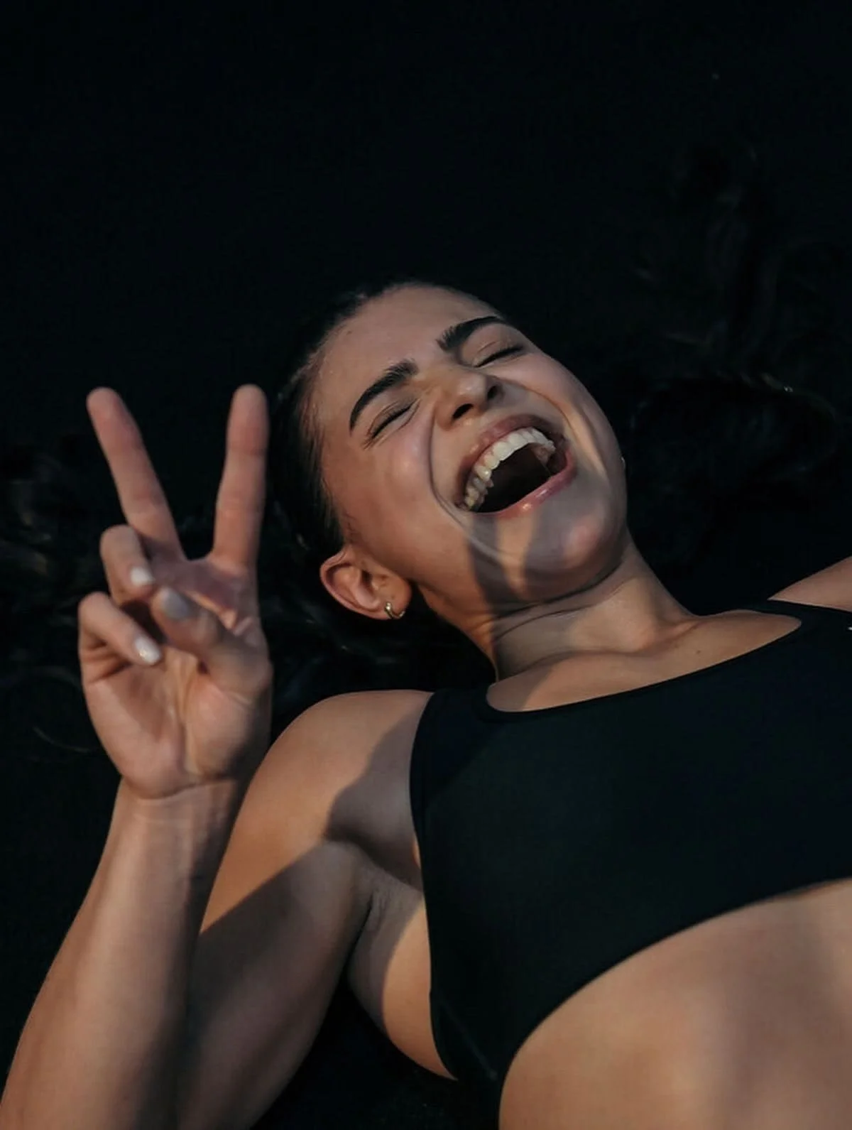
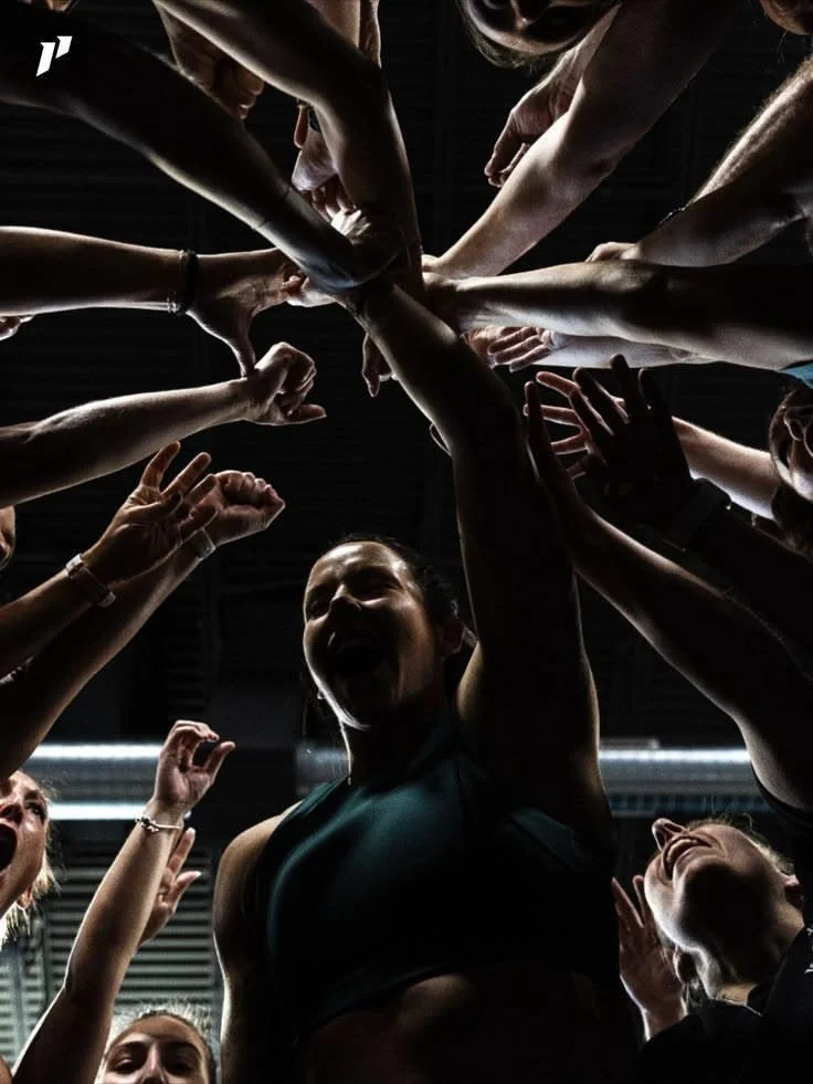
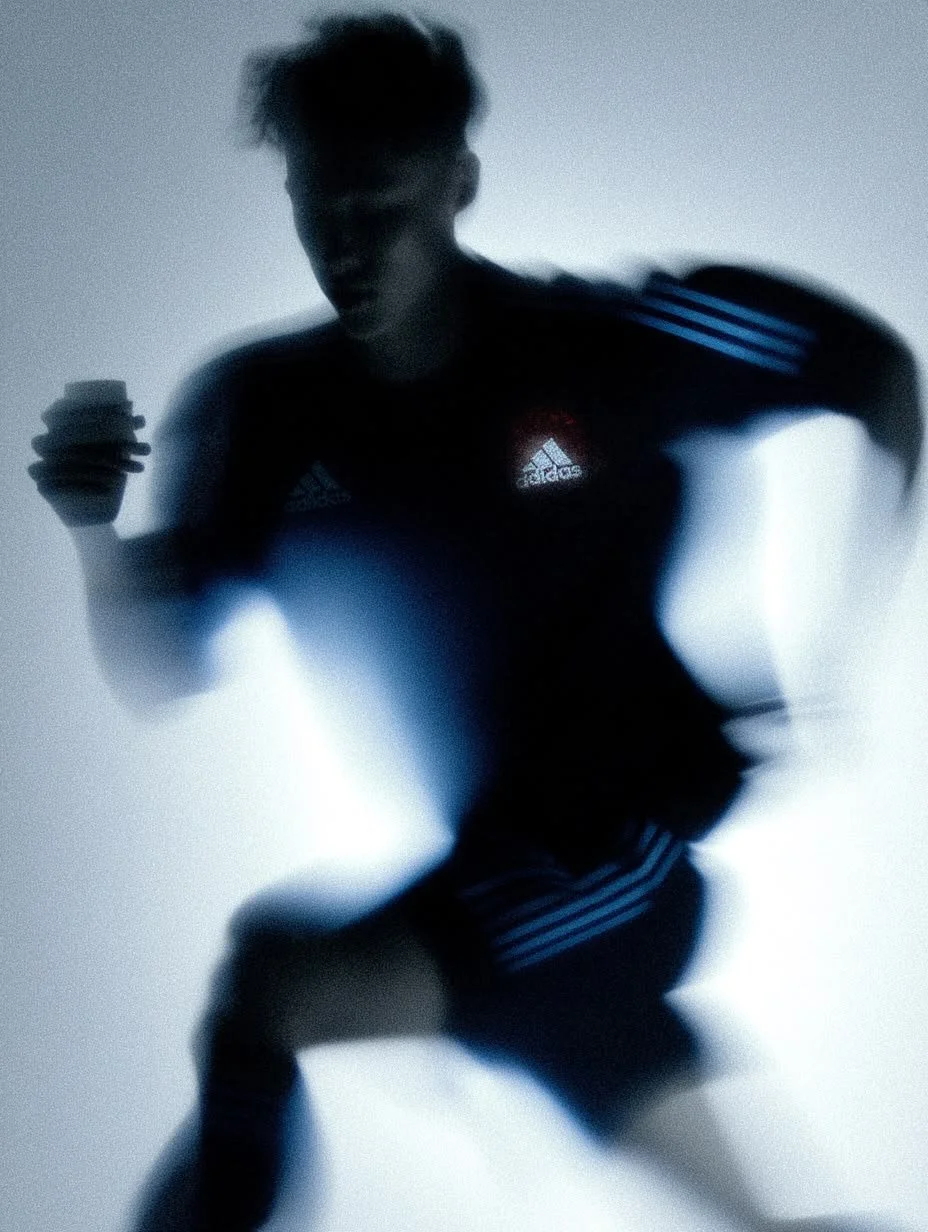
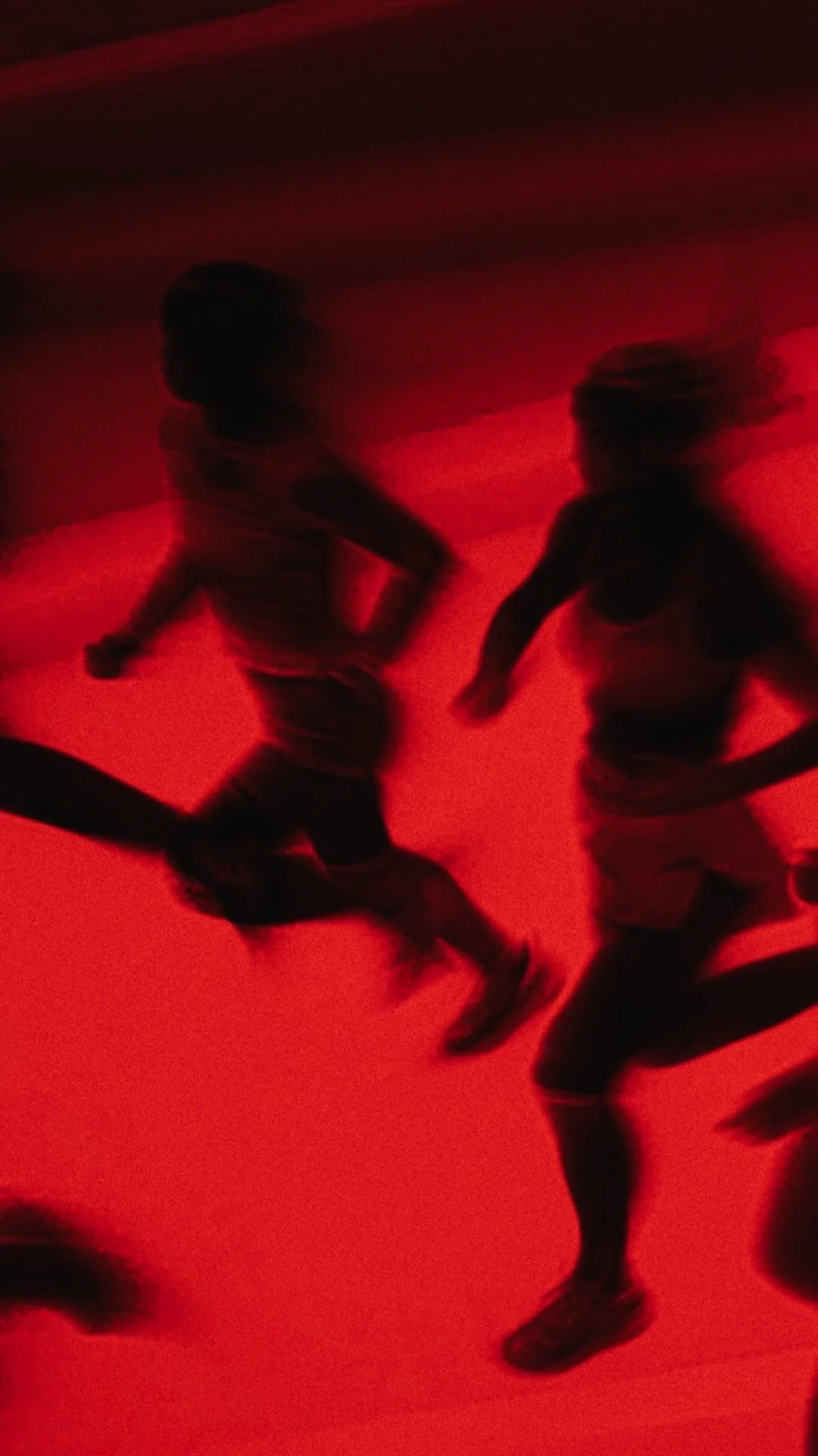
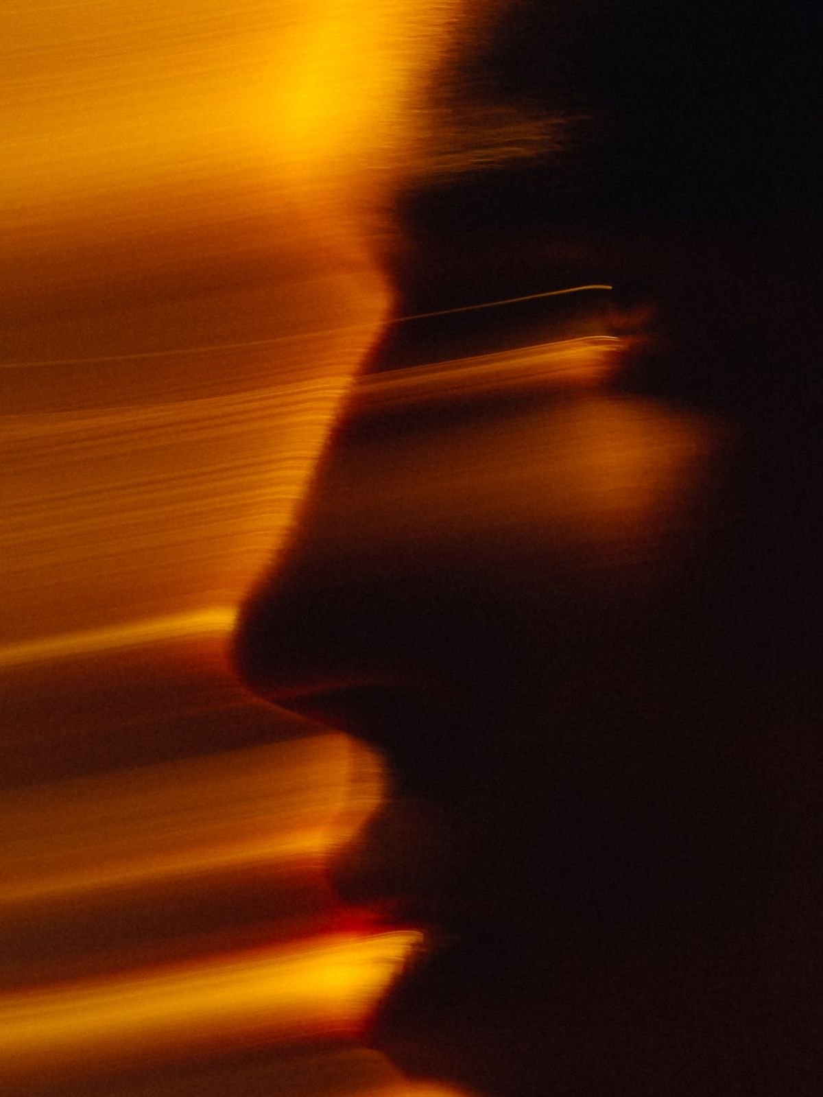
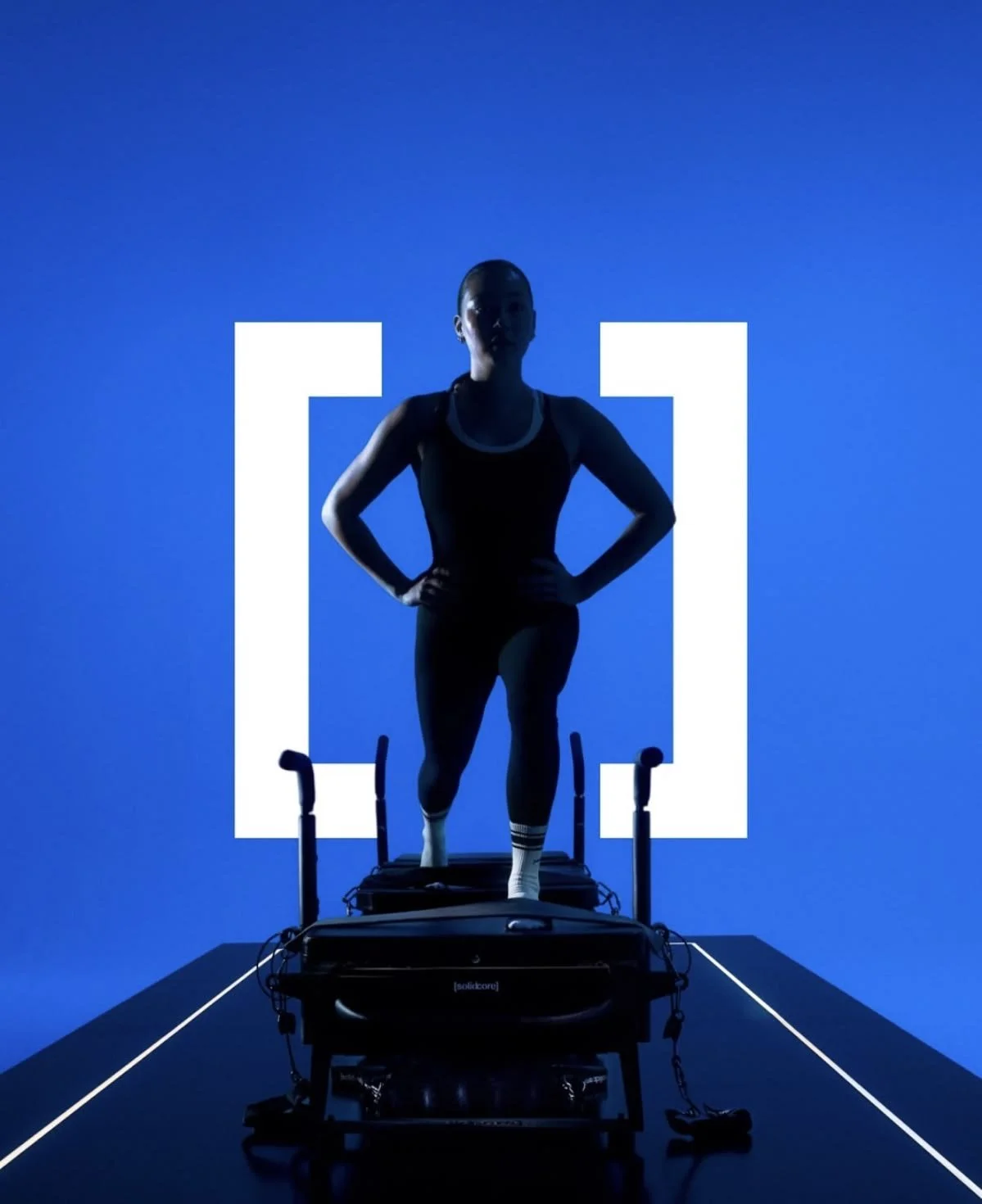
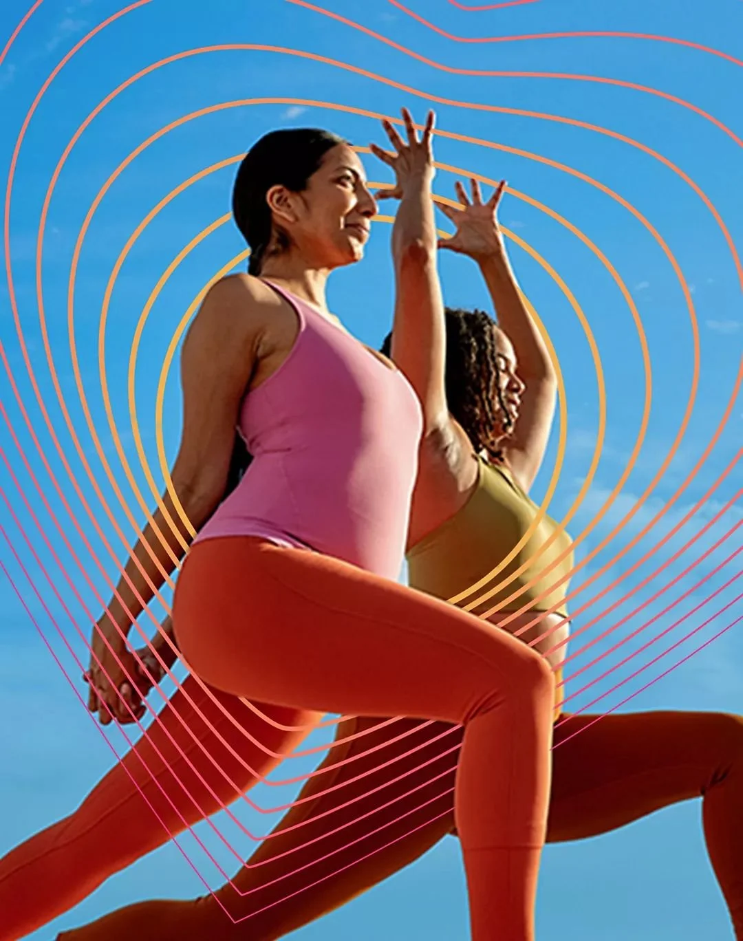
I knew I had to ground to the brand in validity and security. I aimed to show women staying fit alone and together as a group.

Logo Design
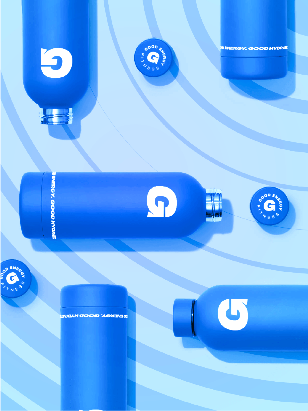
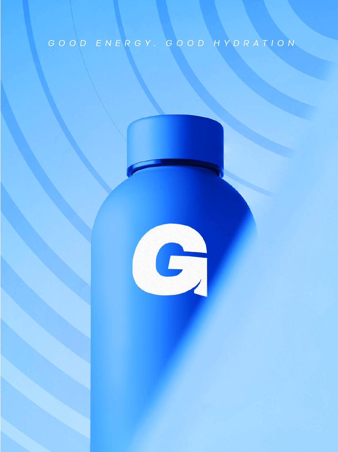
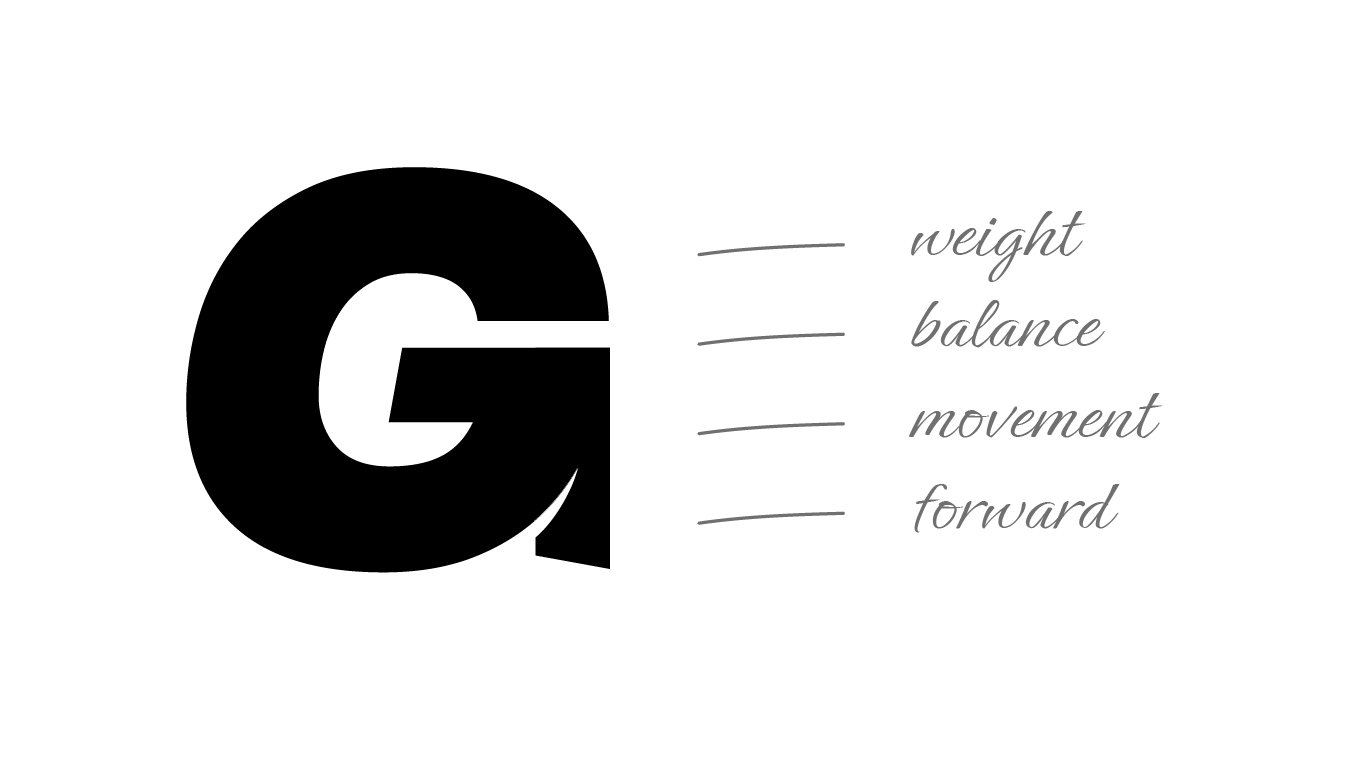
I gave the logo a sense of strength, forward motion and balance. In the “G” mark I took the bar, rotated and cut into it to give the illusion of an arrow.
Keeping movement in the logo, even with just a letter.
Design & Deliverables
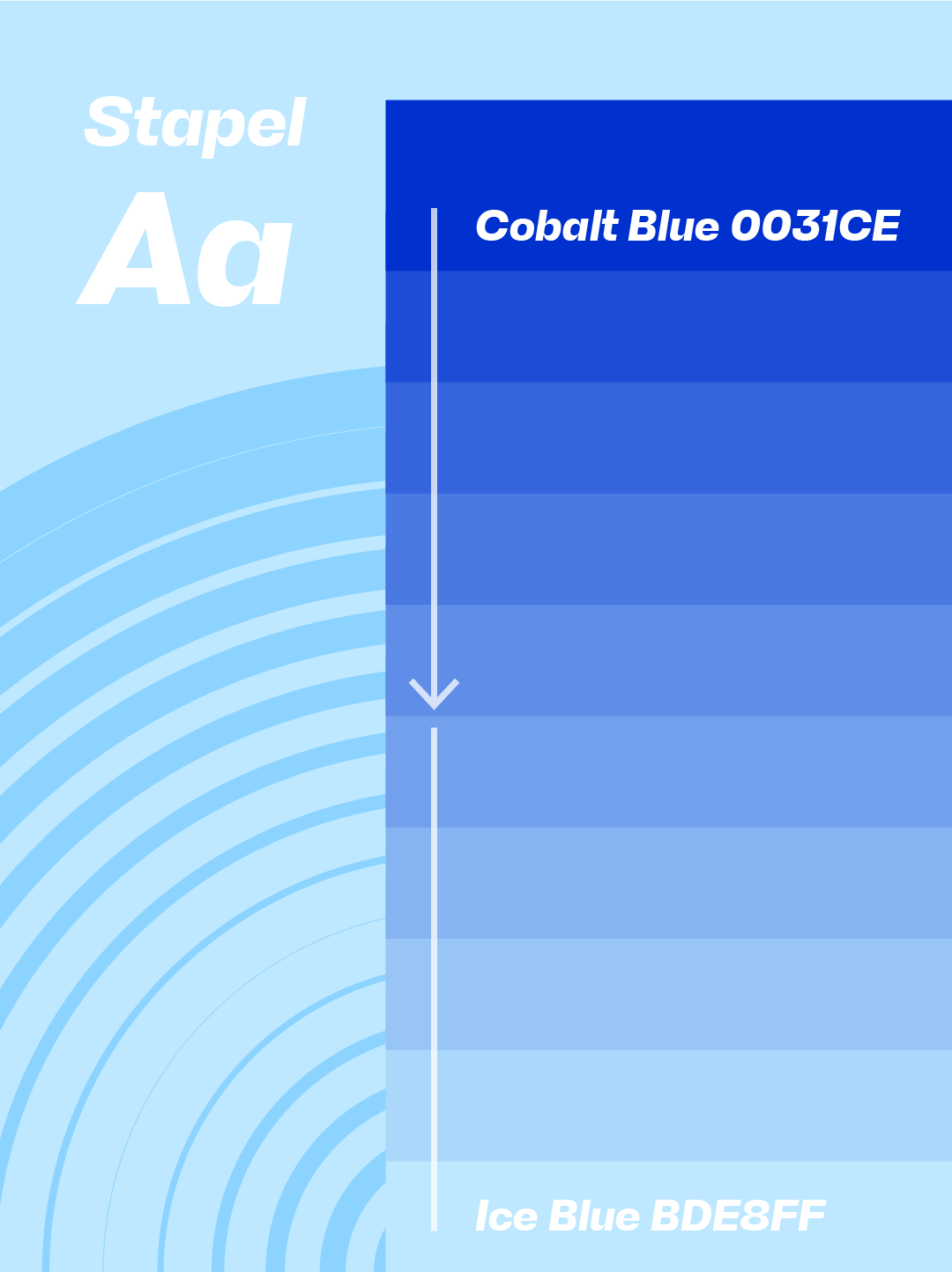
I then devised a brand identity centre around shades of a strong, saturated blue. Blue is a fantastic colour. It can appear bold and impressive while also calming. Perfect for what I want to achieve.
The circle graphic unifies the identity. It symbolises space, growth and movement.
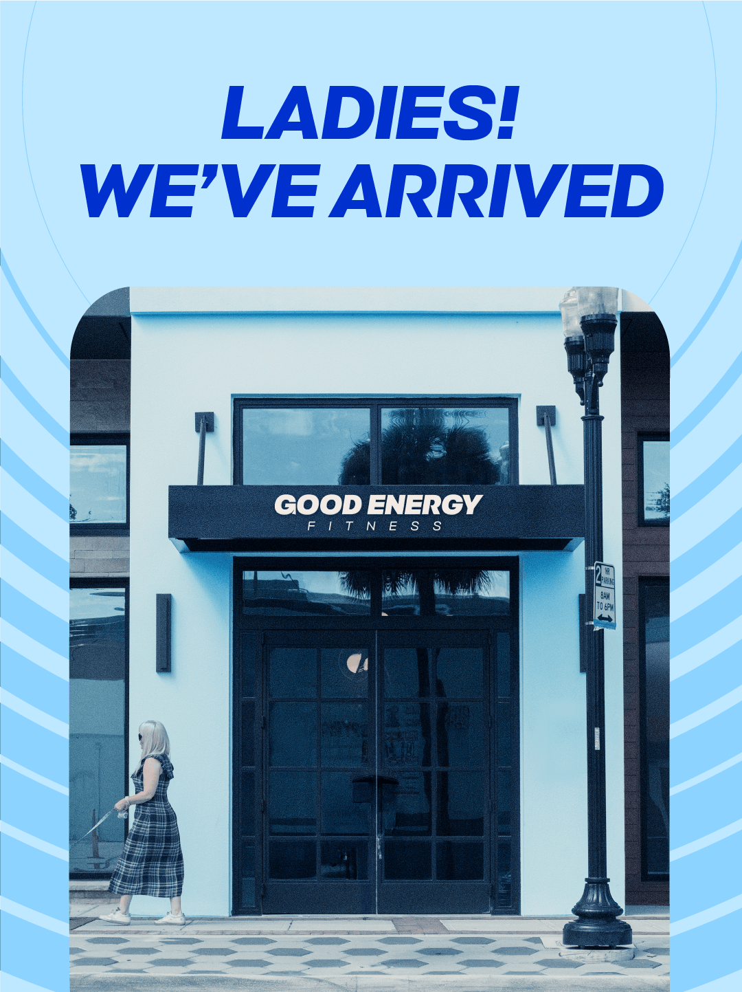
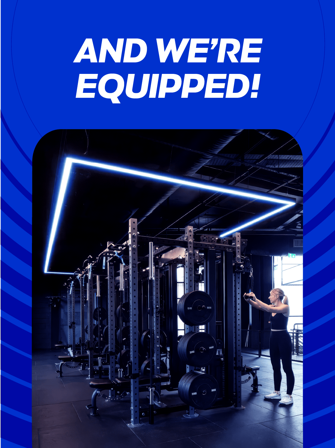
Brand Identity & Campaign
In building out the brand, I saw the strength of the circle device. How it can be used to direct focus, or symbolise space. An app instead of a physical pass also helps push a community angle.