Sporebrew Social
Problem:
A coffee brand at a standstill.
Solution:
Give it a unique personality, structure and voice.
My involvement:
Brand, characters and merch pre-existed. Social identity and creative direction were led exclusively by me.
Deliverables:
• Creative Direction
• Social Identity
Research & Moodboard
The main design already existed but it wasn’t equipped for a can in it’s current state. But having already worked on a Sour Watermelon flavour extension, I was confident when tasked with turning around a consistent and strong can. We looked to a few other prominent energy drinks for inspiration, but in truth there was nothing as powerful as this on the market in England.
Packaging Design
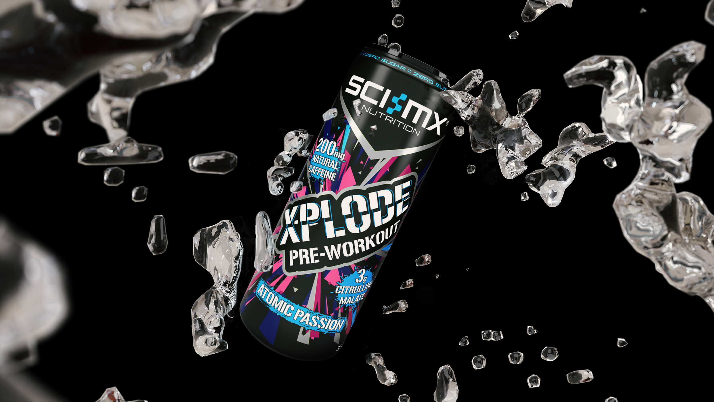
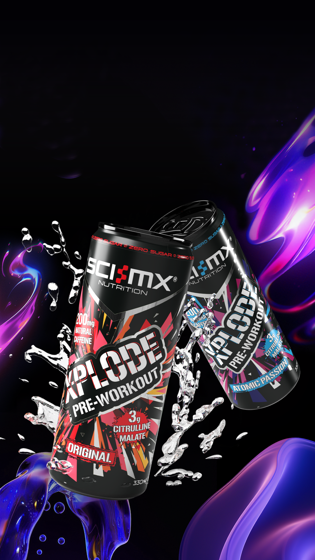
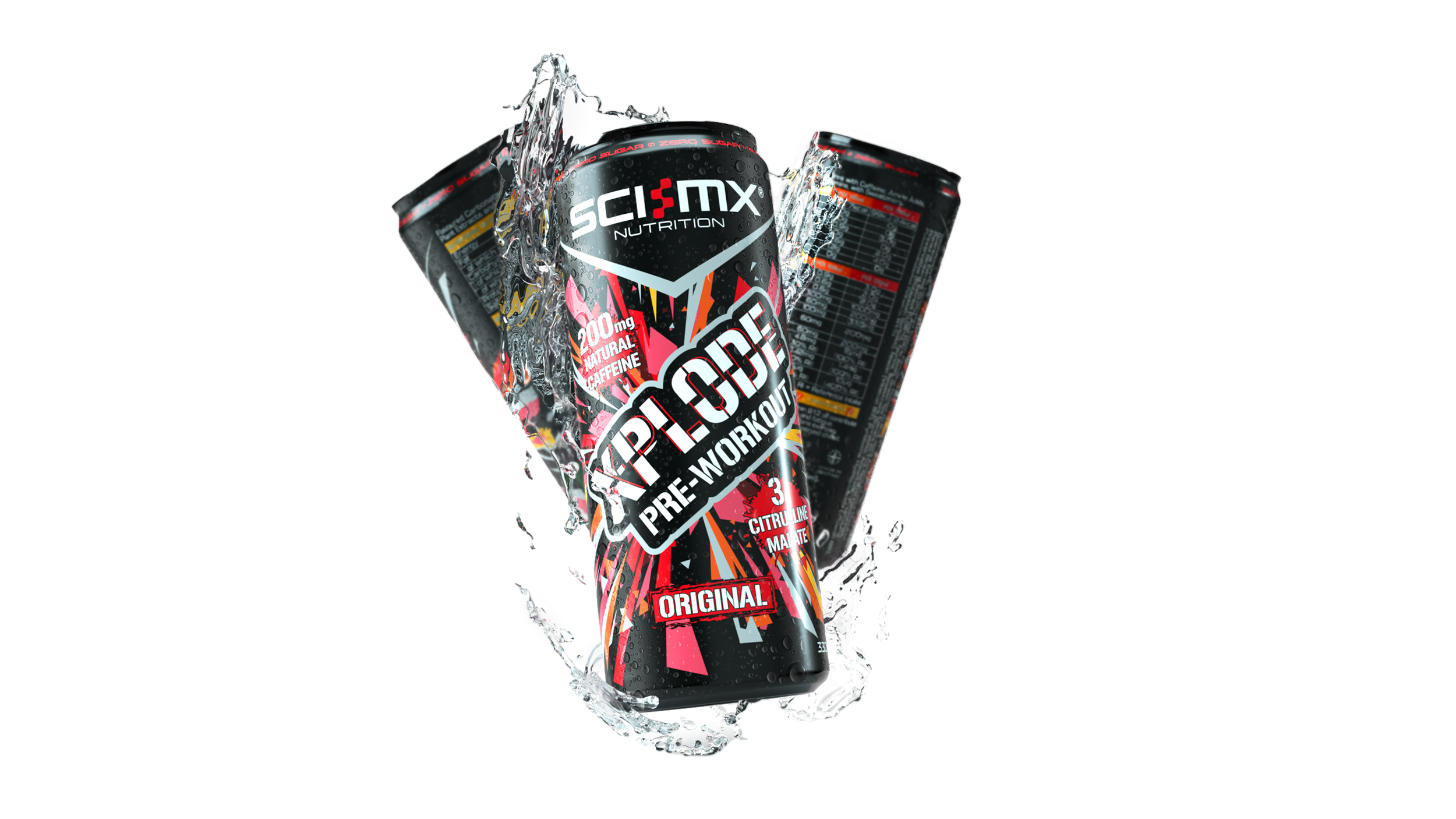
We opted for a metallic can. The logo as it was would have become difficult to distinguish. To give the logo more presence I changed it to be held in a container, all words reading in the same orientation. The lines beneath the block letters would change colour depending on the flavour.
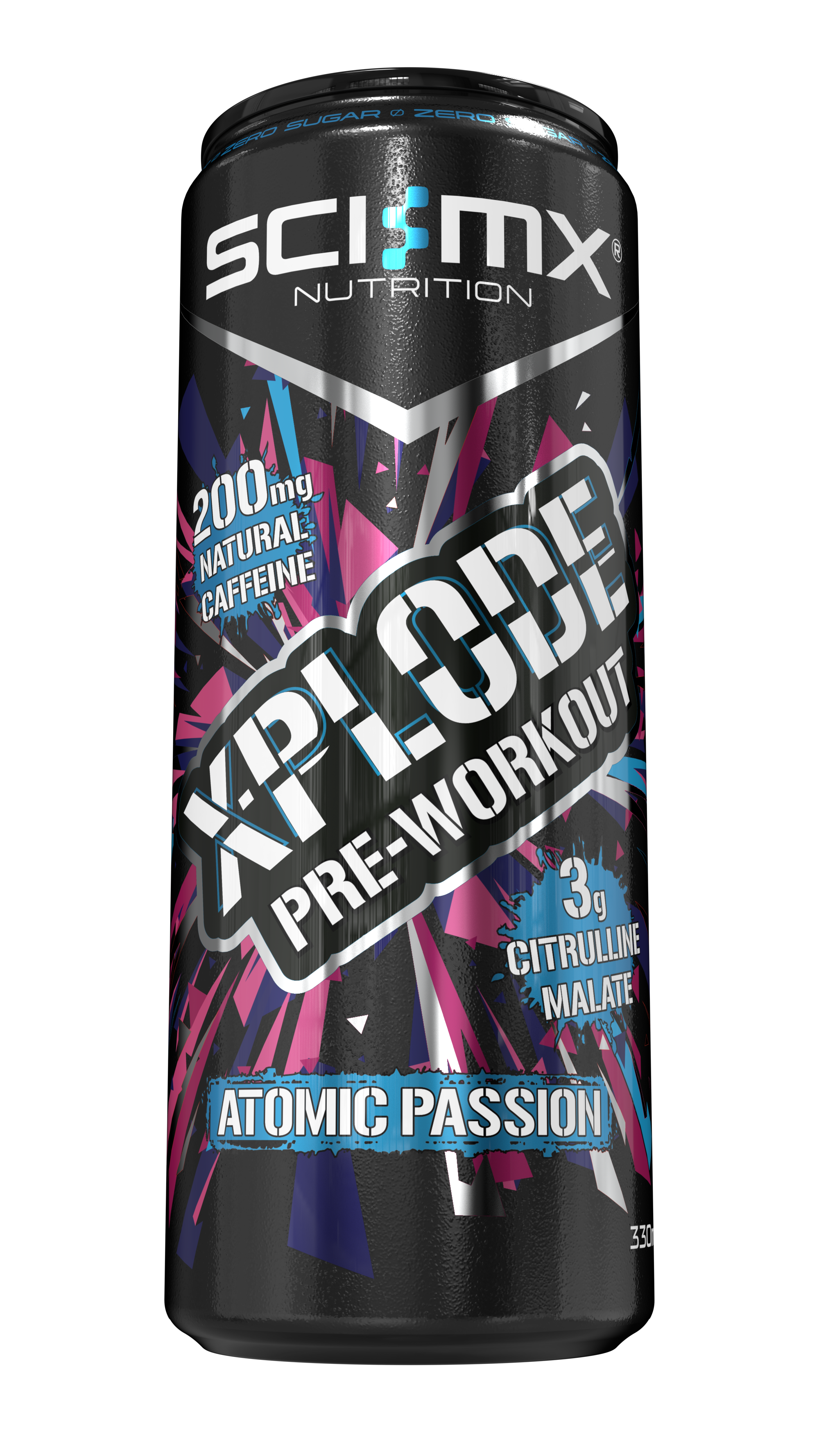
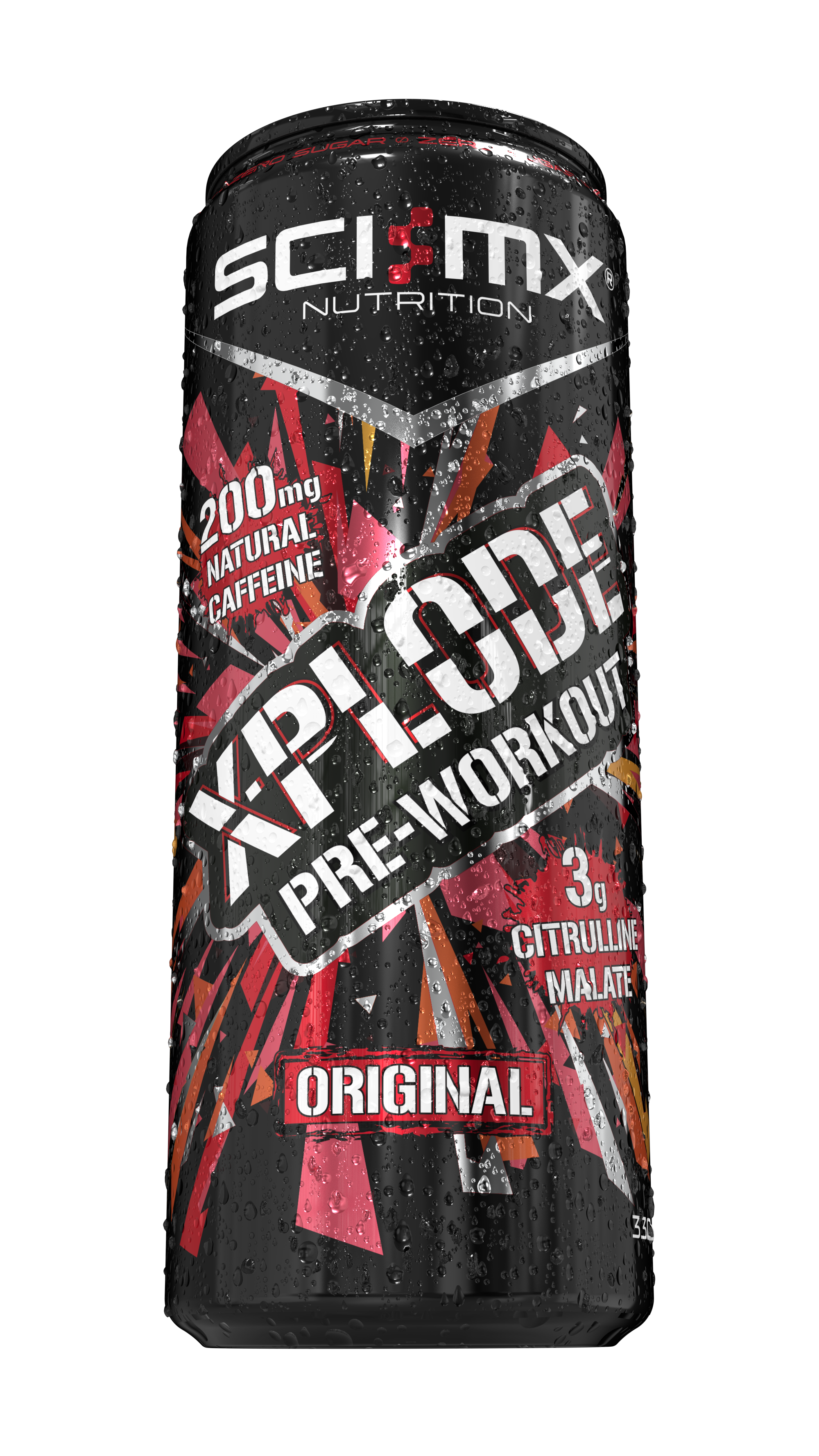
Design & Deliverables
I had designed products before, but this was my first can. A new print material. New guidelines to adhere to. It was hugely beneficial. Since I have been involved in numerous more. Taking lessons from this and building better practices.