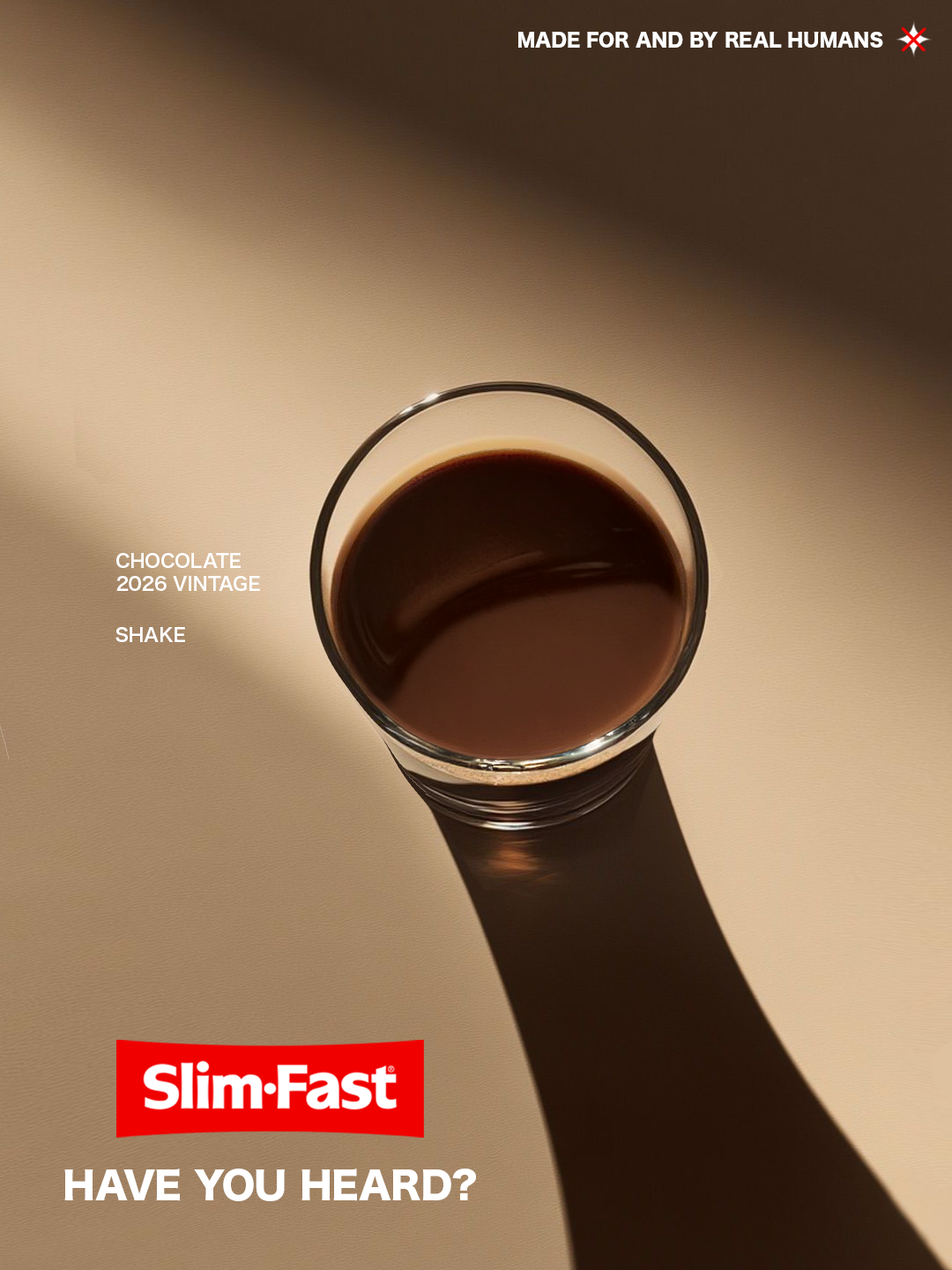
Slimfast Vintage Rebrand
Problem:
A brand is losing its once great relevance.
Solution:
Remind people of who you are.
My involvement:
Planning, creative direction and execution were led exclusively by me.
Deliverables:
• Brand Identity
• Packaging
• Campaign
• Creative Development
Research & Moodboard
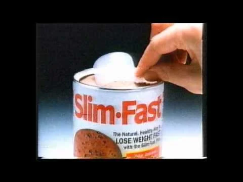
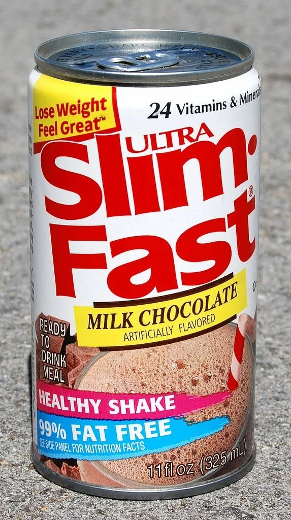
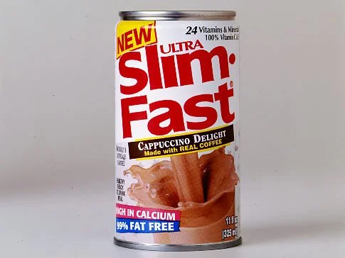
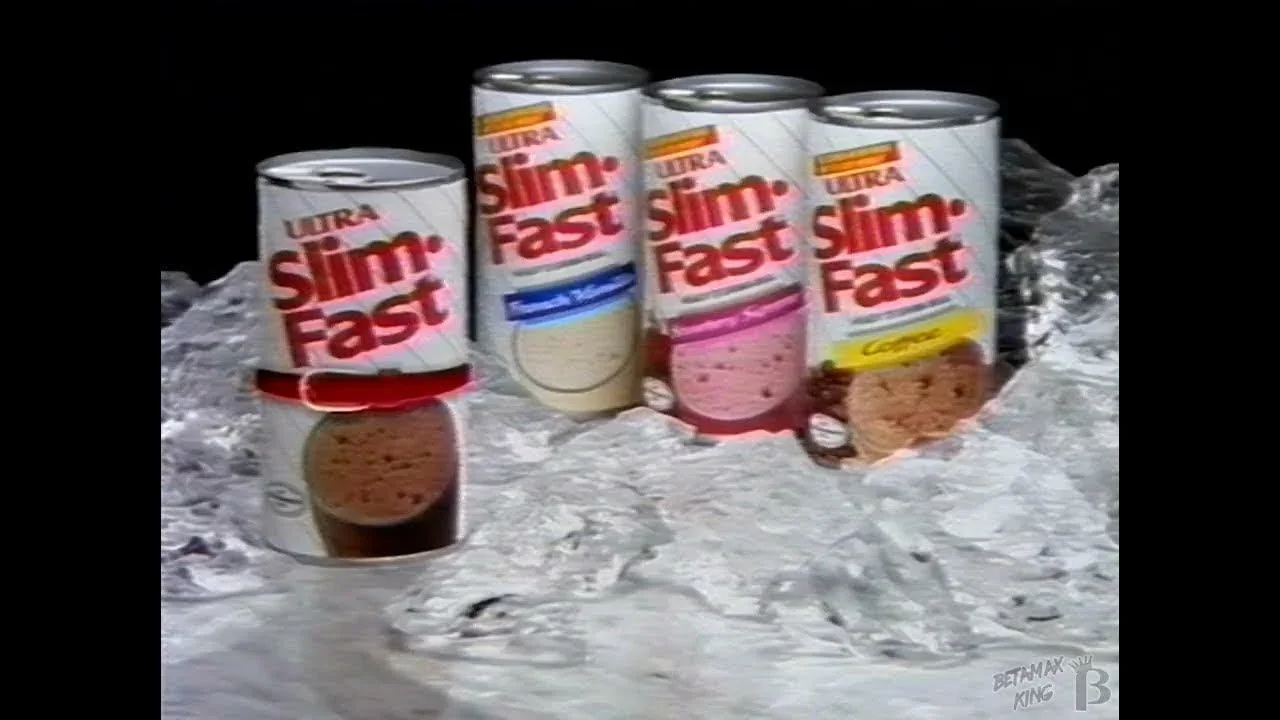
A problem that plagues a lot of brands when they start to lose relevance, is they try desperately to claw it back. It doesn’t always work because consumers are fickle. They move on very quickly the moment they don’t want what your selling. It can be pointless to then try to compete with established names at their own game. Instead, they should return to what worked before. In this case, the taste and notoriety of the past.
Logo Design
Firstly, it needs to be understood when it’s right to change a logo. A logo holds emotional weight with people. Changing it comes with great risks, the most obvious being that customers stop recognising you. For this reason I always tend to look backwards before moving forwards. A logo and colours that served Slimfast for 25 years, could very well serve them today.
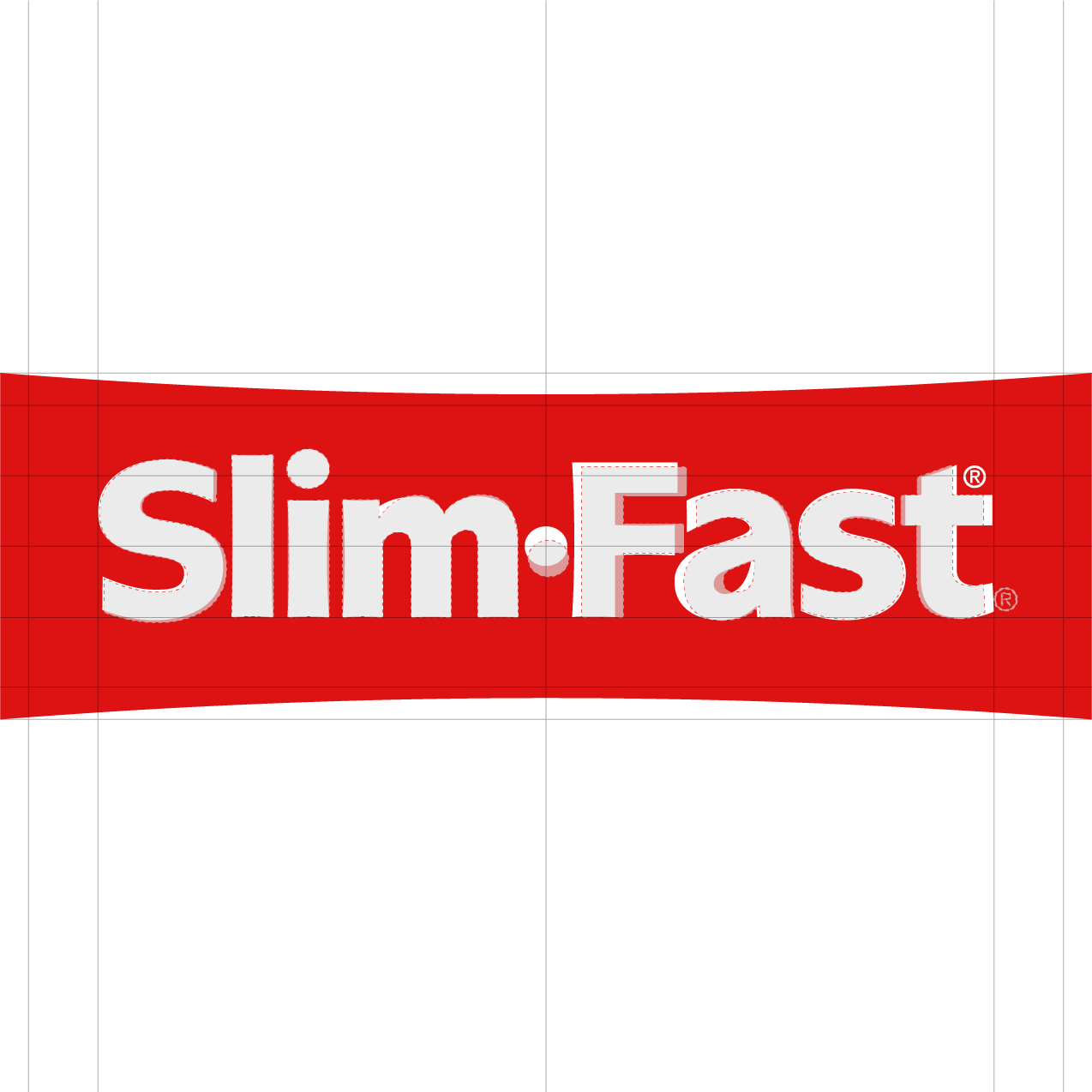
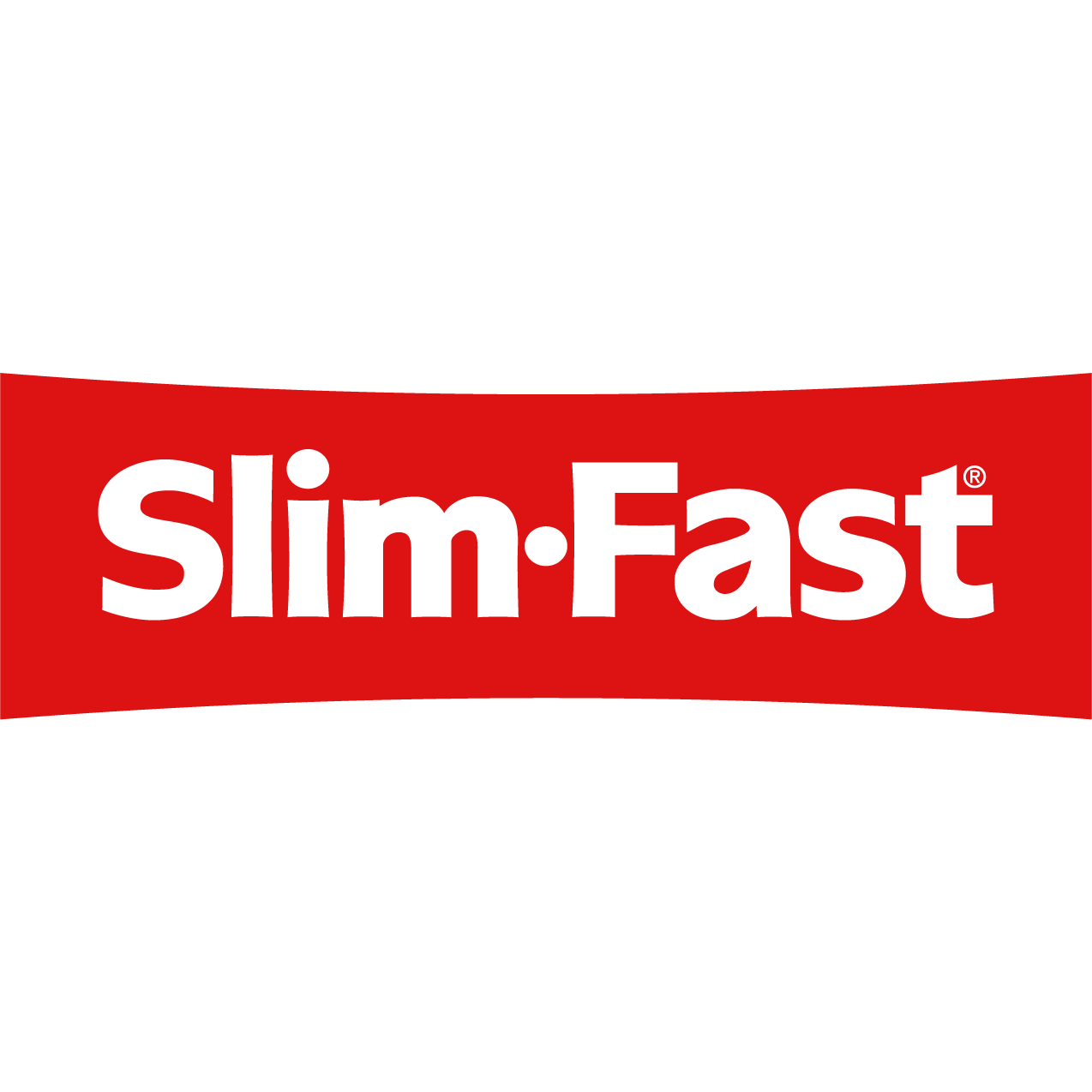
I saw in the original logo a bounce and excitement that the brand needed more of. The original logo needed tweaks to become fully balanced. I leaned into the bouncy nature of the font by containing it within a stretched rectangle. Now we have a logo that is recognisable, balanced and symbolises bouncing back - the main goal of the brand.
Packaging Design
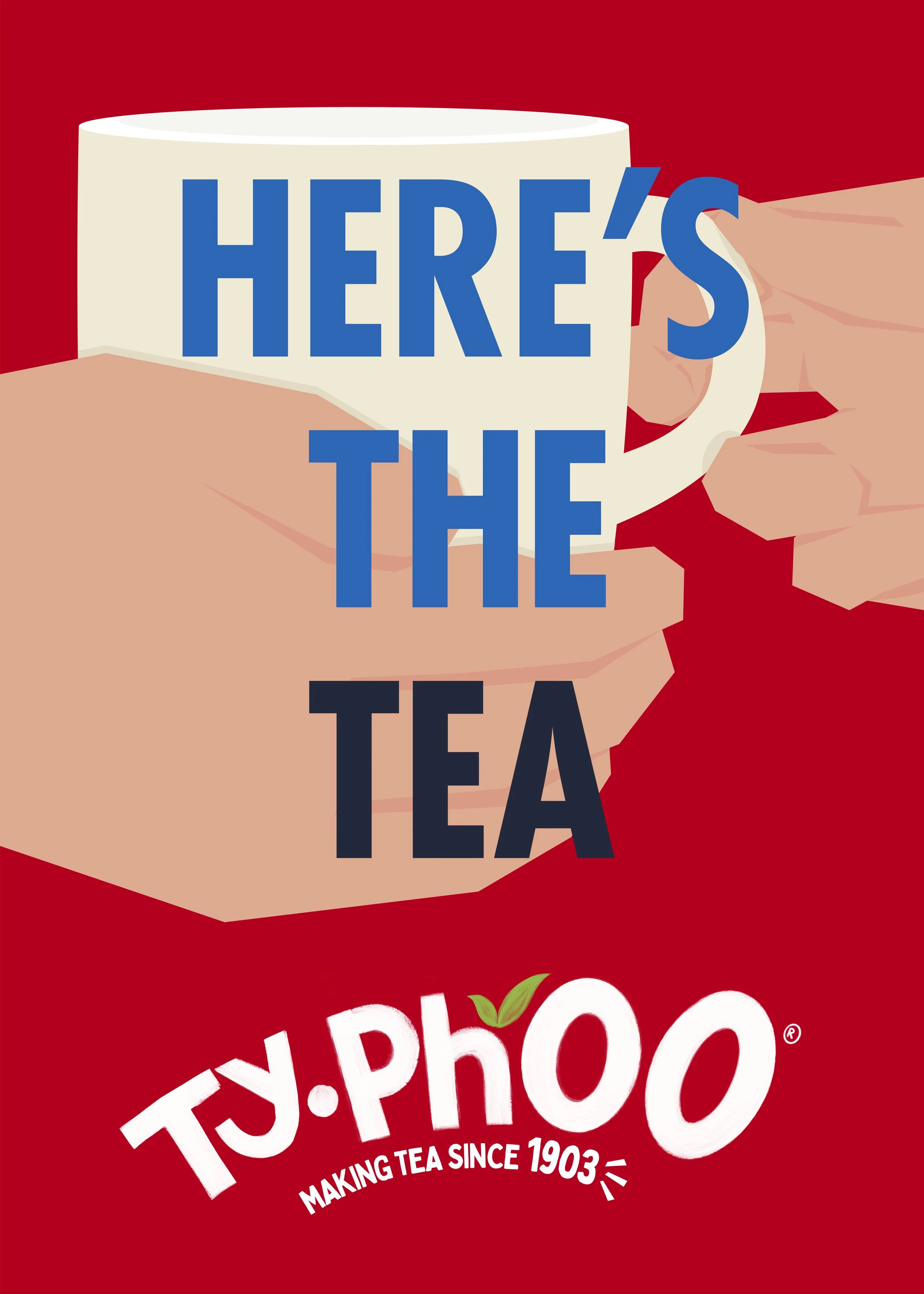
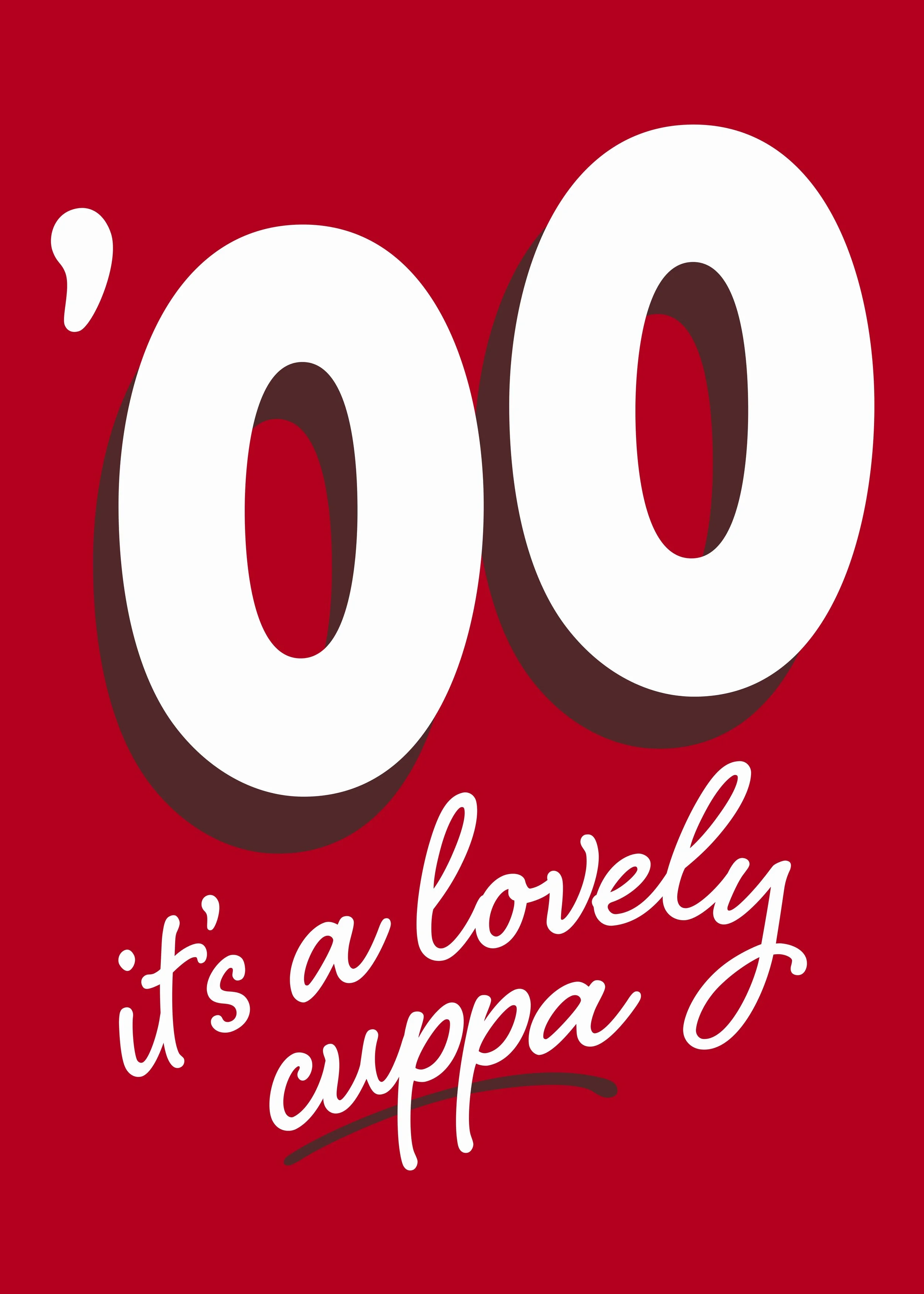
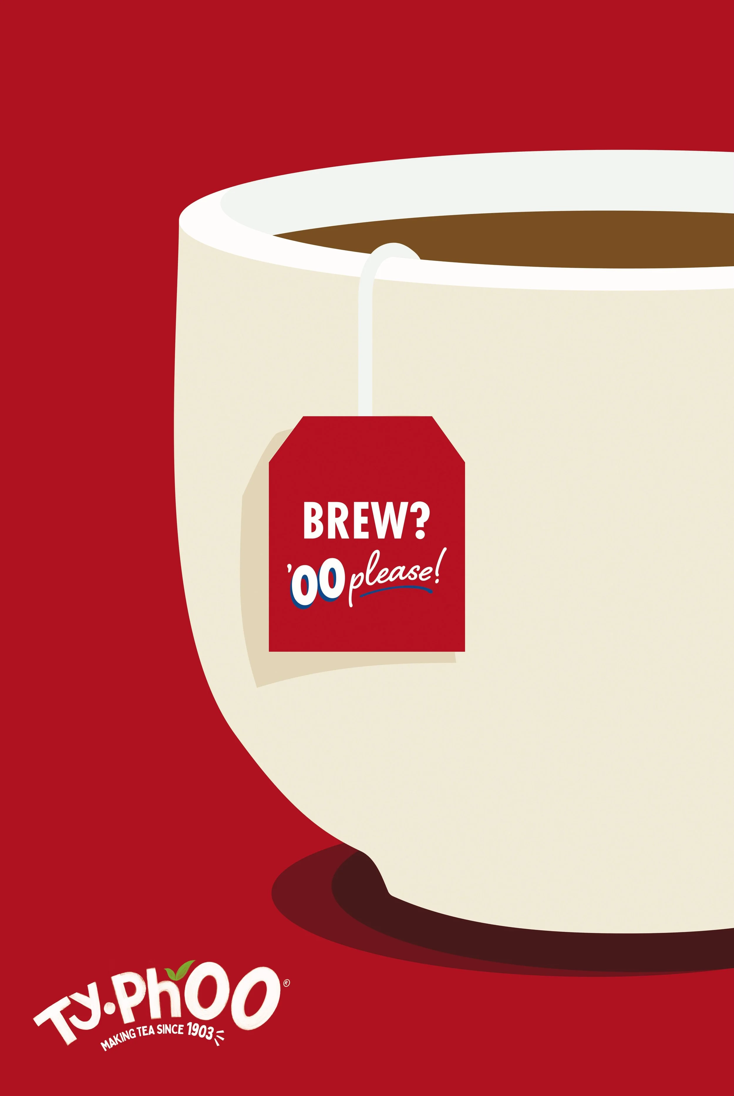
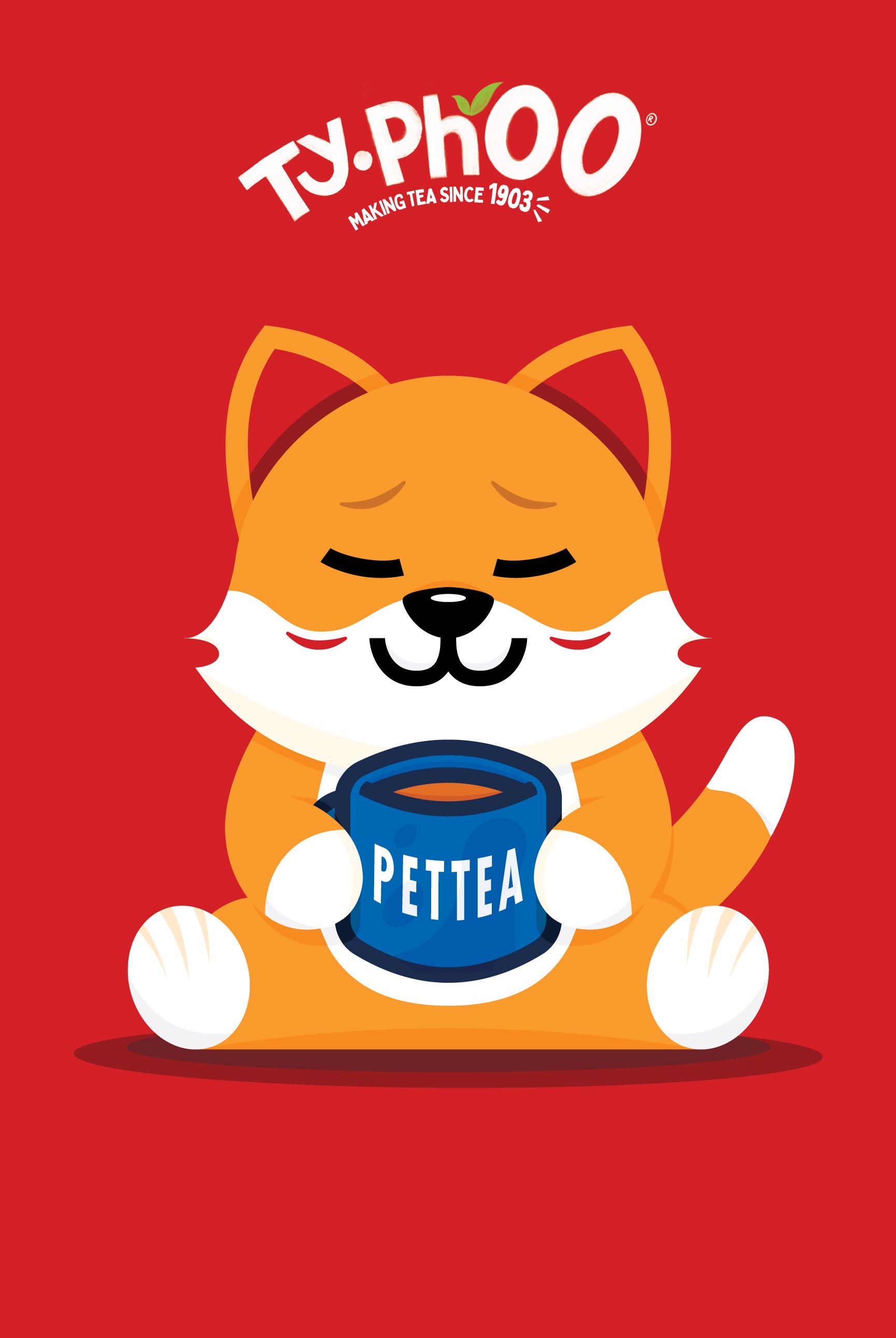
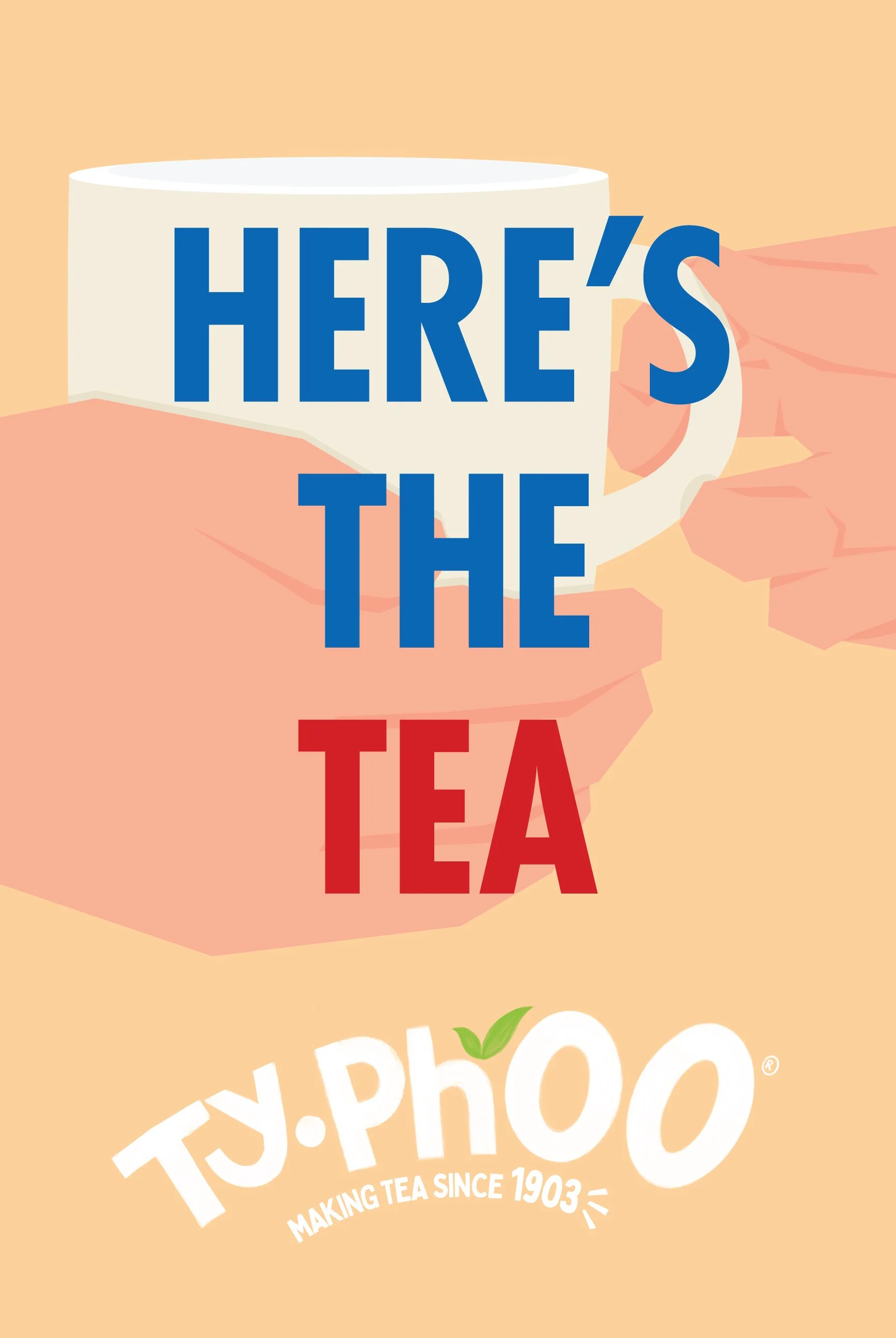
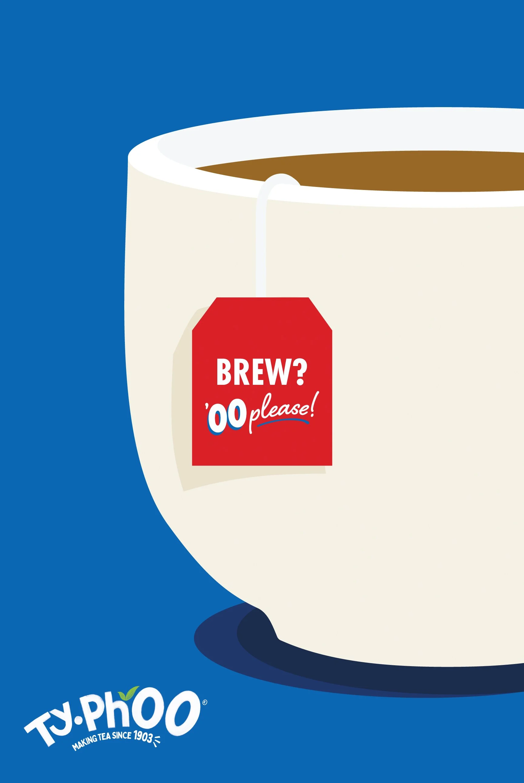
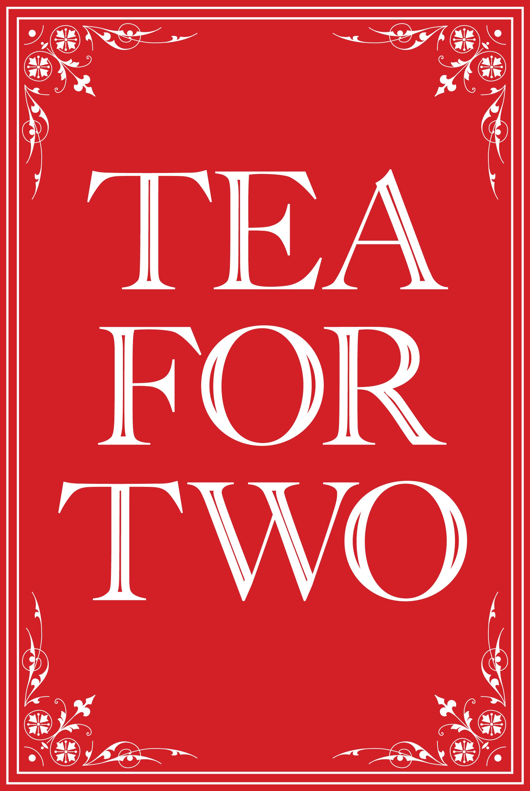
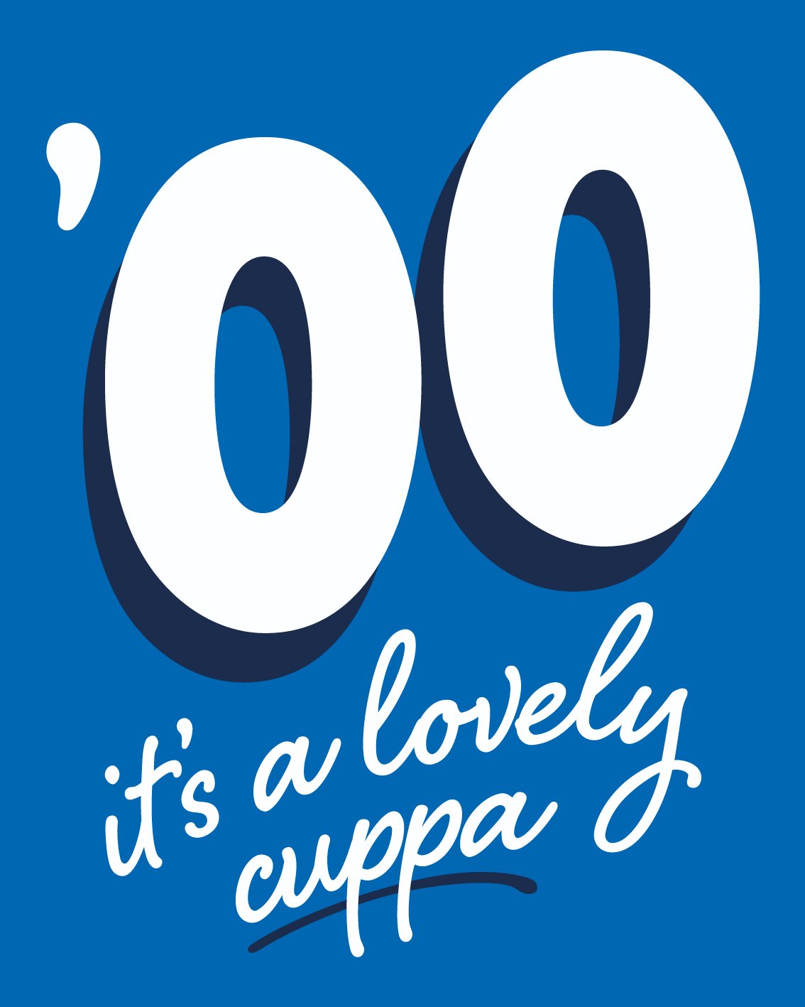
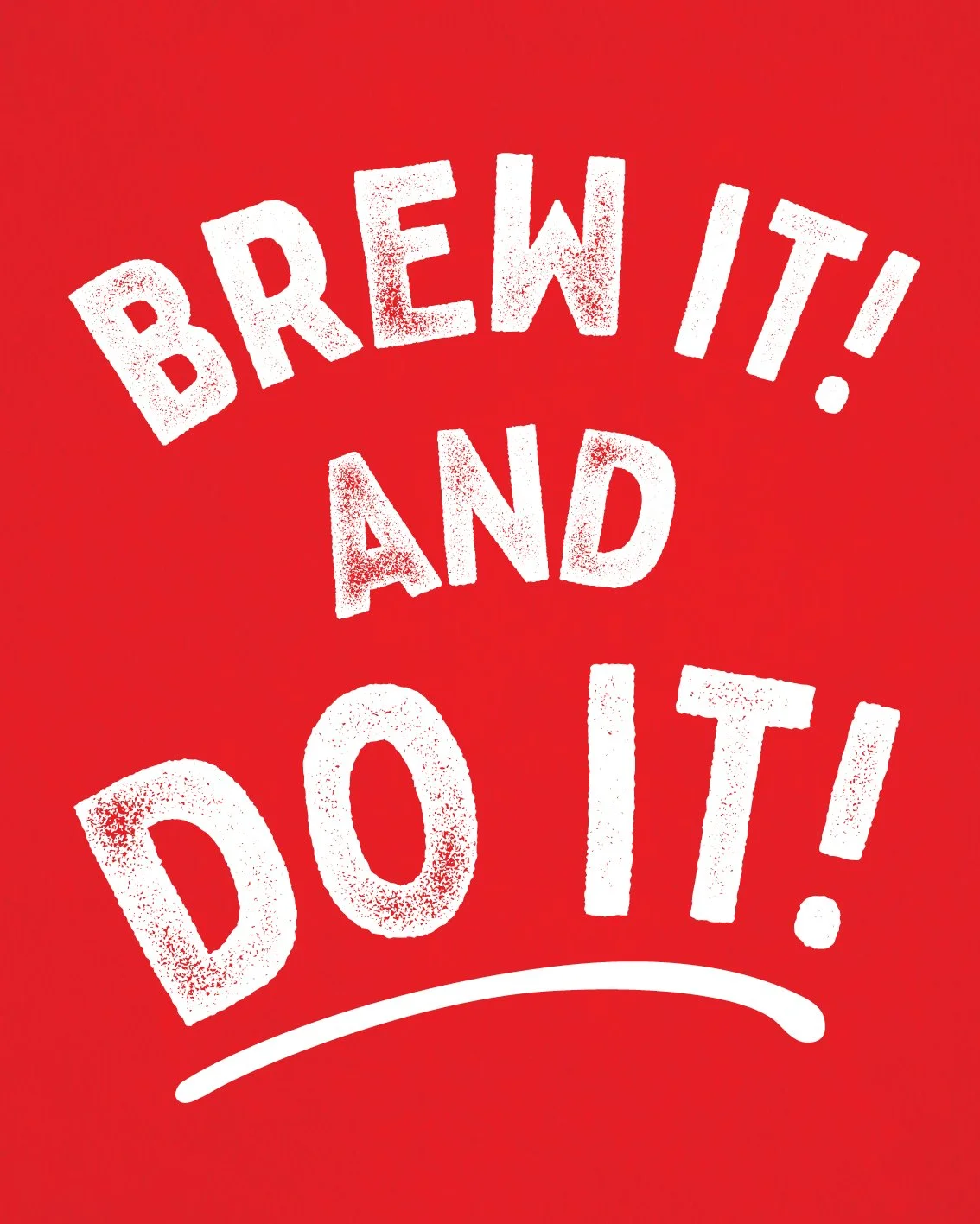
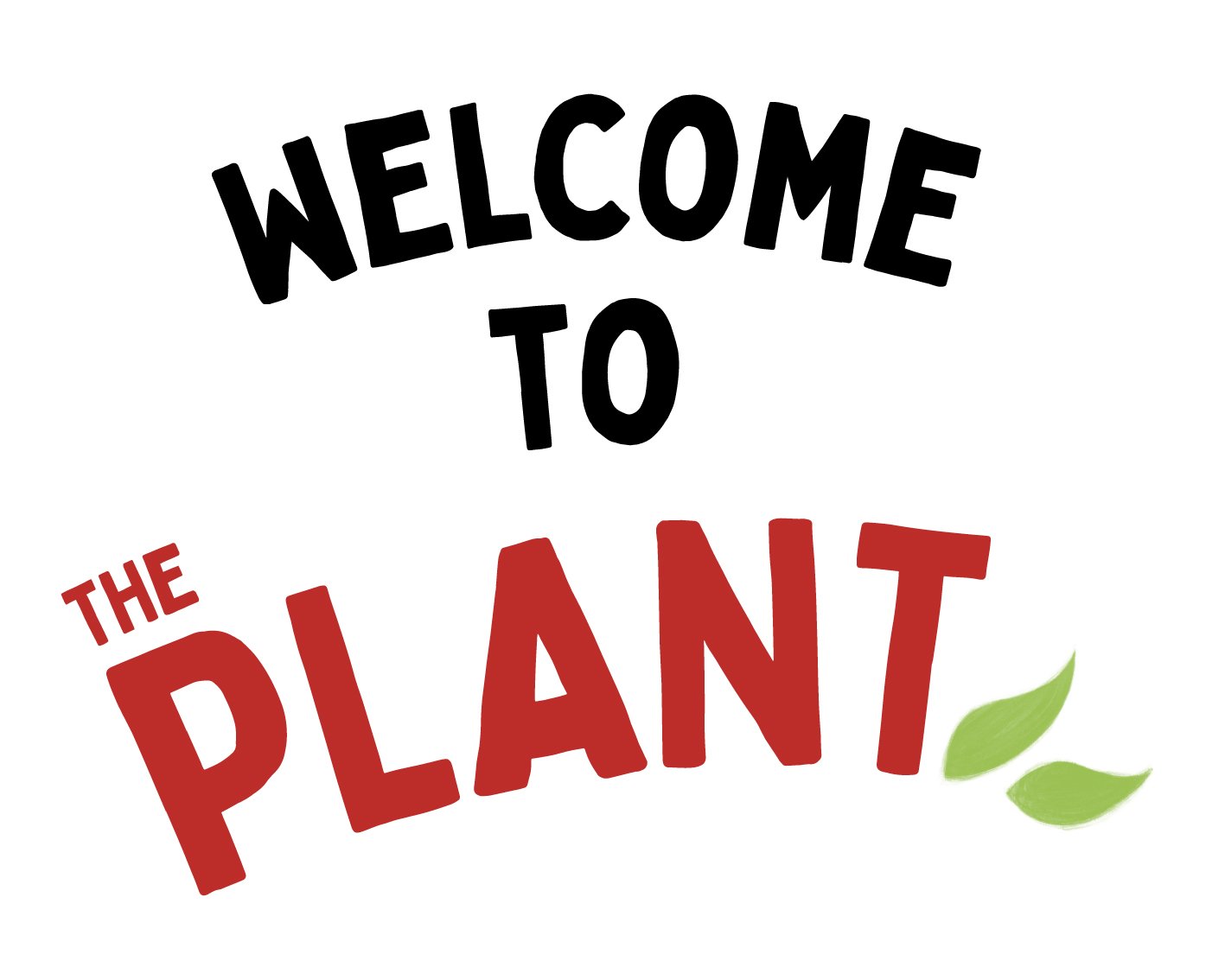
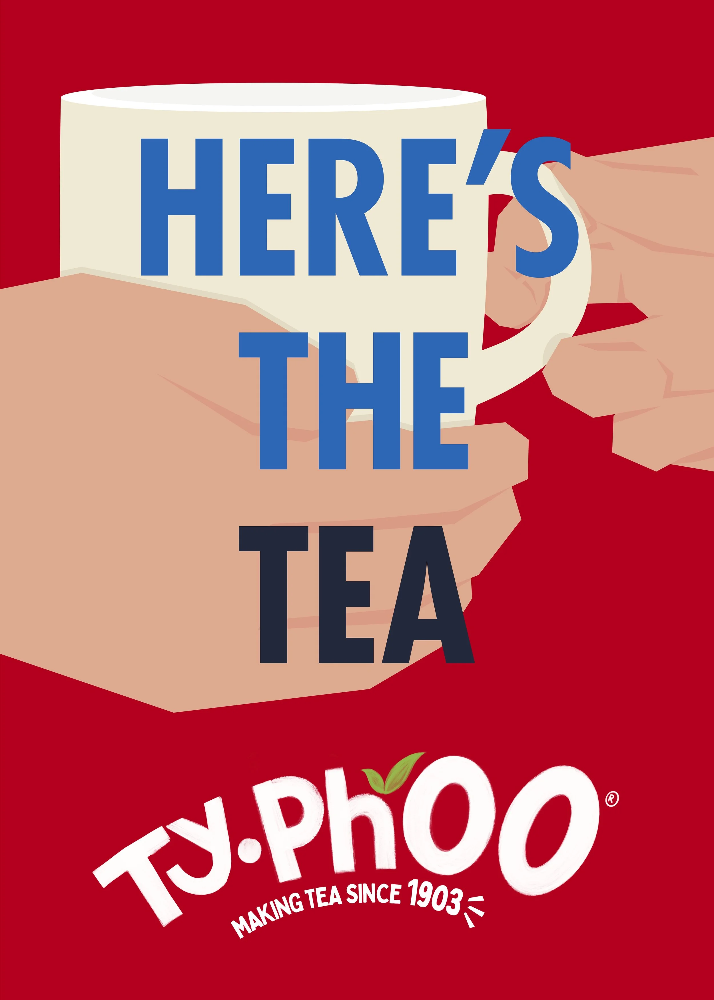
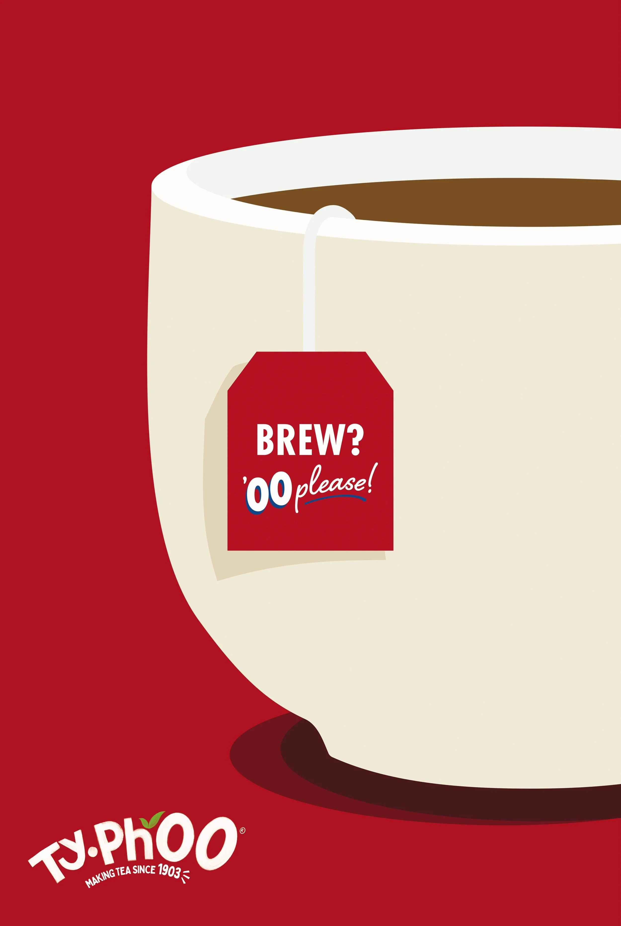
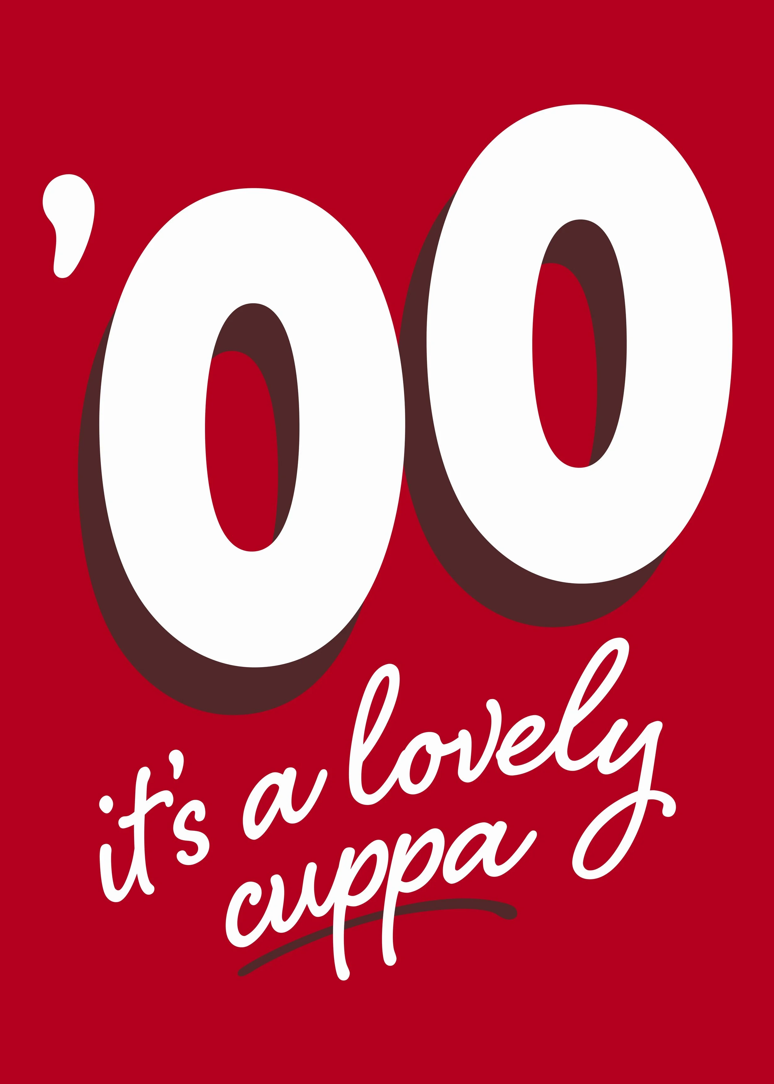
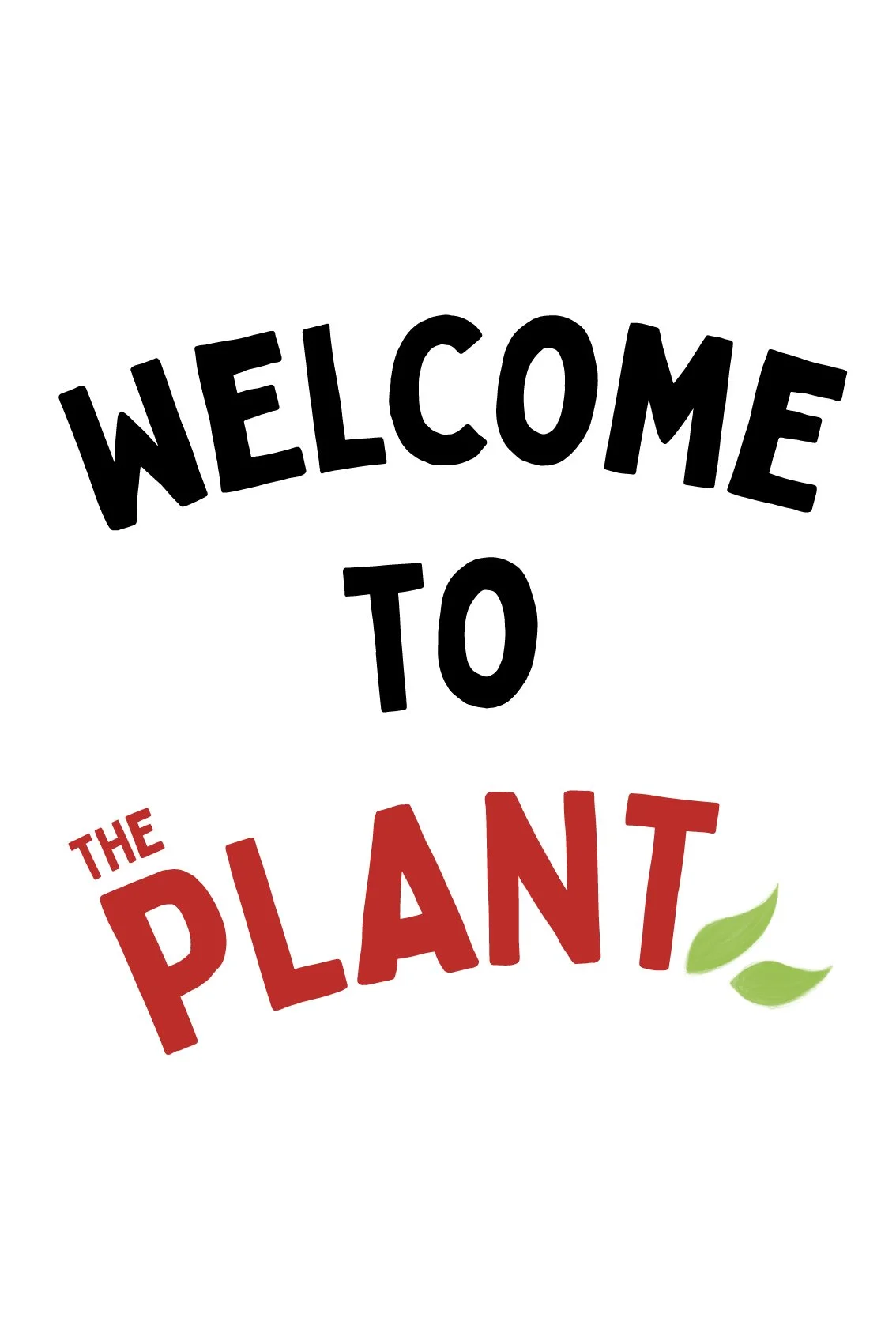
I delivered multiple illustrations of which three were selected, plus a sign for The Plant, Typhoo’s tea packing factory.
The original logo needed tweaking to become fully balanced.
Design & Deliverables
I delivered multiple illustrations of which three were selected, plus a sign for The Plant, Typhoo’s tea packing factory.
Further explorations
More illustrations, colourways and typographic ideas were explored.